NASA’s 3D-printed Mars Habitat competition doles out prizes to concept habs

A multi-year NASA contest to design a 3D-printable Mars habitat using on-planet materials has just hit another milestone — and a handful of teams have taken home some cold hard cash. This more laid-back phase had contestants designing their proposed habitat using architectural tools, with the five winners set to build scale models next year.

Technically this is the first phase of the third phase — the (actual) second phase took place last year and teams took home quite a bit of money.

The teams had to put together realistic 3D models of their proposed habitats, and not just in Blender or something. They used Building Information Modeling software that would require these things to be functional structures designed down to a particular level of detail — so you can’t just have 2D walls made of “material TBD,” and you have to take into account thickness from pressure sealing, air filtering elements, heating, etc.

The habitats had to have at least a thousand square feet of space, enough for four people to live for a year, along with room for the machinery and paraphernalia associated with, you know, living on Mars. They must be largely assembled autonomously, at least enough that humans can occupy them as soon as they land. They were judged on completeness, layout, 3D-printing viability, and aesthetics.

So although the images you see here look rather sci-fi, keep in mind they were also designed using industrial tools and vetted by experts with “a broad range of experience from Disney to NASA.” These are going to Mars, not paperback. And they’ll have to be built in miniature for real next year, so they better be realistic.

The five winning designs embody a variety of approaches. Honestly all these videos are worth a watch; you’ll probably learn something cool, and they really give an idea of how much thought goes into these designs.

Zopherus has the whole print taking place inside the body of a large lander, which brings its own high-strength printing mix to reinforce the “Martian concrete” that will make up the bulk of the structure. When it’s done printing and embedding the pre-built items like airlocks, it lifts itself up, moves over a few feet, and does it again, creating a series of small rooms. (They took first place and essentially tied the next team for take-home case, a little under $21K.)

AI SpaceFactory focuses on the basic shape of the vertical cylinder as both the most efficient use of space and also one of the most suitable for printing. They go deep on the accommodations for thermal expansion and insulation, but also have thought deeply about how to make the space safe, functional, and interesting. This one is definitely my favorite.

Kahn-Yates has a striking design, with a printed structural layer giving way to a high-strength plastic layer that lets the light in. Their design is extremely spacious but in my eyes not very efficiently allocated. Who’s going to bring apple trees to Mars? Why have a spiral staircase with such a huge footprint? Still, if they could pull it off, this would allow for a lot of breathing room, something that will surely be of great value during year or multi-year stay on the planet.

SEArch+/Apis Cor has carefully considered the positioning and shape of its design to maximize light and minimize radiation exposure. There are two independent pressurized areas — everyone likes redundancy — and it’s built using a sloped site, which may expand the possible locations. It looks a little claustrophobic, though.

Northwestern University has a design that aims for simplicity of construction: an inflatable vessel provides the base for the printer to create a simple dome with reinforcing cross-beams. This practical approach no doubt won them points, and the inside, while not exactly roomy, is also practical in its layout. As AI SpaceFactory pointed out, a dome isn’t really the best shape (lots of wasted space) but it is easy and strong. A couple of these connected at the ends wouldn’t be so bad.

The teams split a total of $100K for this phase, and are now moving on to the hard part: actually building these things. In spring of 2019 they’ll be expected to have a working custom 3D printer that can create a 1:3 scale model of their habitat. It’s difficult to say who will have the worst time of it, but I’m thinking Kahn-Yates (that holey structure will be a pain to print) and SEArch+/Apis (slope, complex eaves and structures).

The purse for the real-world construction is an eye-popping $2 million, so you can bet the competition will be fierce. In the meantime seriously watch those videos above, they’re really interesting.


Source: Tech Crunch

Idaho inmates hacked prison-issued tablets for $225,000 in credits

Inmates in Idaho successfully hacked the software of the prison-issued tablets to issue themselves nearly a quarter of a million dollars in credits on the devices that are often one of their only connections to the outside world. The tablets, made by prominent prison vendor JPay, give inmates the ability to use email, listen to music and transfer money, among other basic computing functions but charge fees for some services.

The Associated Press reports that Idaho prison officials discovered 364 inmates leveraging a software vulnerability to increase their JPay account balances. In Idaho, the devices are the result of a partnership between JPay and CenturyLink. The latter company confirmed the software vulnerability but declined to offer further details beyond stating that it had since been resolved.

Of the 364 inmates exploiting JPay, 50 inmates were able to issue themselves credits for more than $1,000. One inmate was able to use the software flaw to self-issue a credit of almost $10,000. The company has recovered about a quarter of the total of around $225,000 so far and has suspended some functions for inmates until they reimburse the stolen credits.

“This conduct was intentional, not accidental. It required a knowledge of the JPay system and multiple actions by every inmate who exploited the system’s vulnerability to improperly credit their account,” Idaho Department of Correction spokesperson Jeff Ray said in a statement on the JPay incident.

The individuals exploiting the JPay system are incarcerated at a handful of Idaho prisons, including Idaho State Correctional Institution, Idaho State Correctional Center, South Idaho Correctional Institution, Idaho Correctional Institution-Orofino and a private Correctional Alternative Placement Plan building.

On its website, JPay describes itself as a “highly trusted name in corrections because we offer a fast and secure method of sending money,” which seems up for debate given the recent turn of events. The company has a presence in prisons across 35 states.


Source: Tech Crunch

Check out this first of its kind, direct-to-consumer urine-testing app with FDA clearance

Urinary tract infections are highly uncomfortable and distracting, and they are very common for women because of the female anatomy. In fact, according to the Mayo Clinic, many women experience more than one infection during their lifetimes.

Many of the afflicted try resolving the infection on their own — using heating pads, drinking more water, taking pain medications. But often, these infections become quickly more advance, a doctor is called, an in-patient visit is made, and the whole terrible episode is only ended after a trip to the pharmacy for some antibiotics.

Until now, at least.

A young San Francisco-based startup called Scanwell Health just this week began selling directly to consumers the first and, for now, the only FDA-cleared urine testing app that allows someone to test their urine at home using a paper test strip and a camera phone. (Its app uses sophisticated color metrics to analyzes the strip and determine what’s what.)

The kits are just $5. A call to a pharmacist on Scanwell’s payroll to confirm the results will cost another $25, but that prescription service will also call in an order for antibiotics immediately if there’s an infection. (Users can also order the antibiotics, but it takes a couple of days for them to arrive.)

The startup — which has so far raised just $120,000 from Y Combinator — was founded by Stephen Chen, a Harvard MBA who has the kind of backstory that makes investors slobber.

Right out of school, he joined Teco Diagnostics a now 33-year-old maker of in-vitro diagnostics and medical devices, first as an R&D manager and later as a GM. Using what he’d learned there, he left Teco in 2013 to create a separate company, Petnostics, which makes a urine test for pets that can help identify a range of issues, from diabetes to kidney stones to bacterial infections. He even pitched the company on the show “Shark Tank,” which was hosting open tryouts within distance of his home a couple of year ago, and he landed $300,000 in exchange for 20 percent of the company.

While the exposure was great, the terms were not, suggests Chen, who says he ultimately didn’t take the money. He didn’t need to, apparently. Petnostics is still a going concern and it has generated enough revenue to support the development of Scanwell, which Chen says was always part of his master plan. In fact, Chen started the FDA approval for Scanwell nearly three years ago. The reason: UTI testing for humans is a much bigger market, especially when factoring in the billions of dollars that are wasted on emergency room trips for UTIs each year. Though hard to fathom, a visit to the ER for the condition can cost a stunning $2,600.

What happens from now depends on how effectively Scanwell reaches its target market, but so far, it seems, so good.

Though the direct-to-consumer service will take some time (different states have different regulations around over-the-phone prescription services), people in California and select other states can use the service today. In the meantime, Scawell is making its kits available on as many college campuses as possible, given UTIs tend to be prevalent at schools because students are sexually active.

The company is also looking to work more closely with insurance companies, arguing it can help them improve their own quality ratings by using Scanwell kits to reduce Medicare and other insurance payouts.

Not last, the four-person team is already working on other urine-based tests, including a test that identifies chronic kidney disease, and another test for cardiovascular diseases.

Says Chen, “Paper test are so cheap. They can reach people through the mail. It’s kind of like when AOL used to send out a bunch of discs. We can work with health providers to work with their patient populations and reach them more effectively through home tests.”

Hopefully, they’ll agree with Chen. Certainly, as he notes, home access to diagnostics is “long overdue.”


Source: Tech Crunch

Why unskippable Stories ads could revive Facebook

Prepare for the invasion of the unskippables. If the Stories social media slideshow format is the future of mobile TV, it’s going to end up with commercials. Users won’t love them. And done wrong they could pester people away from spending so much time watching what friends do day-to-day. But there’s no way Facebook and its family of apps will keep letting us fast-forward past Stories ads just a split-second after they appear on our screens.

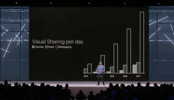
We’re on the cusp of the shift to Stories. Facebook estimates that across social media apps, sharing to Stories will surpass sharing through feeds some time in 2019. One big reason is they don’t take a ton of thought to create. Hold up your phone, shoot a photo or short video and you’ve instantly got immersive, eye-catching, full-screen content. And you never had to think.

Facebook CPO Chris Cox at F8 2018 charts the rise of Stories that will see the format surpass feed sharing in 2019

Unlike text, which requires pre-meditated reflection that can be daunting to some, Stories are point and shoot. They don’t even require a caption. Sure, if you’re witty or artistic you can embellish them with all sorts of commentary and creativity. They can be a way to project your inner monologue over the outside world. But the base level of effort necessary to make a Story is arguably less than sharing a status update. That’s helped Stories rocket to more than 1.3 billion daily users across Facebook’s apps and Snapchat.

The problem, at least for Facebook, is that monetizing the News Feed with status-style ads was a lot more straightforward. Those ads, which have fueled Facebook’s ascent to earning $13 billion in revenue and $5 billion in profit per quarter, were ostensibly old-school banners. Text, tiny photo and a link. Advertisers have grown accustomed to them over 20 years of practice. Even small businesses on a tight budget could make these ads. And it at least took users a second to scroll past them — just long enough to make them occasionally effective at implanting a brand or tempting a click.

Stories, and Stories ads, are fundamentally different. They require big, tantalizing photos at a minimum, or preferably stylish video that lasts five to 15 seconds. That’s a huge upward creative leap for advertisers to make, particularly small businesses that’ll have trouble shooting that polished content themselves. Rather than displaying a splayed out preview of a link, users typically have to swipe up or tap a smaller section of a Story ad to click through.

And Stories are inherently skippable. Users have learned to rapidly tap to progress slide by slide through friends’ Stories, especially when racing through those with too many posts or that come from more distant acquaintances. People are quick with the trigger finger the moment they’re bored, especially if it’s with an ad.

A new type of ad blindness has emerged. Instead of our eyes glazing over as we scroll past, we stare intensely searching for the slightest hint that something isn’t worth our time and should be skipped. A brand name, “sponsored” label, stilted product shot or anything that looks asocial leads us to instantly tap past.

This is why Facebook COO Sheryl Sandberg scared the hell out of investors on the brutal earnings call when she admitted about Stories that, “The question is, will this monetize at the same rate as News Feed? And we honestly don’t know.” It’s a radically new format advertisers will need time to adopt and perfect. Facebook had spent the past year warning that revenue growth would decelerate as it ran out of News Feed ad inventory, but it’d never stressed the danger as what it was: Stories. That contributed to its record-breaking $120 billion share price drop.

The shift from News Feed ads to Stories ads will be a bigger transition than desktop ads to mobile ads for Facebook. Feed ads looked and worked identically, it was just the screen around them changing. Stories ads are an entirely new beast.

Stories ads are a bigger shift than web to mobile

There is one familiar format Stories ads are reminiscent of: television commercials. Before the age of TiVo and DVRs, you had to sit through the commercials to get your next hit of content. I believe the same will eventually be true for Stories, to the tune of billions in revenue for Facebook.

Snapchat is cornered by Facebook’s competition and desperate to avoid missing revenue estimates again. So this week, it rolled out unskippable vertical video ads it actually calls “Commercials” to 100 more advertisers, and they’ll soon be self-serve for buyers. Snap first debuted them in May, though the six-second promos are still only inserted into its longer-form multi-minute premium Shows, not user-generated Stories. A Snap spokesperson said they couldn’t comment on future plans. But I’d expect its stance will inevitably change. Friends’ Stories are interesting enough to compel people to watch through entire ads, so the platform could make us watch.

Snapchat is desperate, and that’s why it’s already working on unskippable ads. If Facebook’s apps like Instagram and WhatsApp were locked in heated battle with Snapchat, I think we’d see more brinkmanship here. Each would hope the other would show unskippable ads first so it could try to steal their pissed-off users.

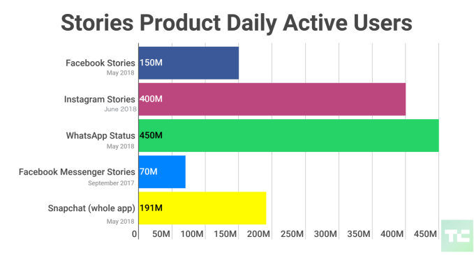
But Facebook has largely vanquished Snapchat, which has seen user growth sink significantly. Snapchat has 191 million daily users, but Facebook Stories has 150 million, Messenger Stories has 70 million, Instagram Stories has 400 million and WhatsApp Stories (called Status) leads with 450 million. Most people’s friends around the world aren’t posting to Snapchat Stories, so Facebook doesn’t risk pushing users there with overly aggressive ads, except perhaps amongst U.S. teens.

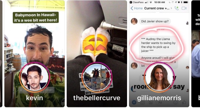
Instagram’s three-slide Stories carousel ads

That’s why I expect we’ll quickly see Facebook start to test unskippable Stories ads. They’ll likely be heavily capped at first, to maybe one to three per day per user. Facebook took a similar approach to slowly rolling out auto-play video News Feed ads back in 2014. And Facebook’s apps will probably only show them after a friend’s story before your next pal’s, in-between rather than as dreaded pre-rolls. Instagram already offers carousel Stories ads with up to three slides instead of one, so users have to tap three times to blow past them.

An Instagram spokesperson told me they had “no plans to share right now” about unskippable ads, and a Facebook spokesperson said “We don’t have any plans to test unskippable stories ads on Facebook or Instagram.” But plans can change. A Snap spokesperson noted that unlike a full 30-second TV spot, Snapchat’s Commercials are up to six seconds, which matches an emerging industry trend for mobile video ads. Budweiser recently made some six-second online ads that it also ran on TV, showing the format’s reuseability that could speed up adoption. For brand advertisers not seeking an on-the-spot purchase, they need time to leave an impression.

By making some Stories ads unskippable, Facebook’s apps could charge more while making them more impactful for advertisers. It would also reduce the creative pressure on businesses because they won’t be forced to make that first split-second so flashy so people don’t fast-forward. Employing unskippable ads could also create an incentive for people to pay for a hypothetical ad-free Facebook Premium subscription in the future.

If Facebook makes the Stories ad format work, it has a bright future that contrasts with the doomsday vibes conjured by its share price plummet. Facebook has more than 5X more (duplicated) Stories users across its apps than its nearest competitor Snapchat. The social giant sees libraries full of Stories created each day waiting to be monetized.


Source: Tech Crunch

Viacom acquires Gen Z digital media company AwesomenessTV

Viacom today confirmed it’s acquiring digital media company AwesomenessTV, whose network reaches 158 million subscribers and approximately 300 million monthly views. The news follows a report from earlier this week that said the two were in talks about an acquisition, which priced the deal at “well below $300 million,” according to Variety.

Viacom did not confirm the deal terms, but an under $300 million price point would be less than half of AwesomenessTV’s previous $650 million valuation, cited by Bloomberg.

Prior to this, AwesomenessTV was majority owned by Comcast/NBCUniversal which has a 51 percent stake in the company; Hearst and (TechCrunch parent company by way of Oath), Verizon, are minority shareholders with 24.5 percent stakes. When Verizon acquired its stake two years ago, it spent around $159 million, which valued the business then at the $650 million price point, or double its valuation at the time Hearst invested in 2014.

“Awesomeness has done an incredible job building their brand into a digital media powerhouse for today’s most sought-after and hard-to-reach youth audiences,” said Kelly Day, President of Viacom Digital Studios and former Chief Business Officer of AwesomenessTV, in a statement about the deal. “The team brings strong digital expertise, deep connections with top talent and influencers, a world-class television and film studio, and a robust branded content team and creative agency that will accelerate the growth and scale of Viacom Digital Studios.”

Viacom’s interest in the property has to do with its ability to reach young viewers – specifically “Gen Z” viewers who are growing up watching YouTube, not traditional TV. AwesomenessTV has reach into this market by way of its 158 million total subscribers and over 6 million YouTube subscribers.

Viacom sees its youth focus as a natural fit that falls in between its younger Nickelodeon and older MTV audiences.

AwesomenessTV’s studio has put out Emmy-winning content, and has developed a library of over 200 hours of long-form TV series and feature films, which it brings to Viacom. It also has connections with those in the digital-native talent and influencer space of value. And it has established relationships with advertisers catering to this youth market, including Hollister, Gatorade, Invisalign, and Kraft, which Viacom took into consideration when making this deal.

Following the deal’s close, AwesomenessTV will be integrated into Viacom’s Digital Studios division led by president Kelly Day, while its existing CEO Jordan Levin will depart. Levin will remain during a transition period only, we understand. But a CEO is no longer needed as AwesomenessTV will not operate as a standalone entity.

AwesomenessTV was co-founded by Brian Robbins, who currently serves as President of Paramount Players at Viacom, and Joe Davola. Robbins connection likely helped to spark the talks, sources had earlier told Variety.

Viacom seemed an ideal suitor for the business, given its interest in digital video/influencer space, which it has acted on before with its February acquisition of the video creator conference VidCon, and its acquisition of the influencer marketing firm Whosay.

The news of the deal also follows the high-profile closure of one of AwesomenessTV partners’ efforts in the streaming space: Verizon’s go90. Verizon had been working with AwesomenessTV to develop short-form original programming for its misguided streaming service go90, which failed to take off and is shutting down for good this month.


Source: Tech Crunch

Google revamps local events search to include personalized suggestions

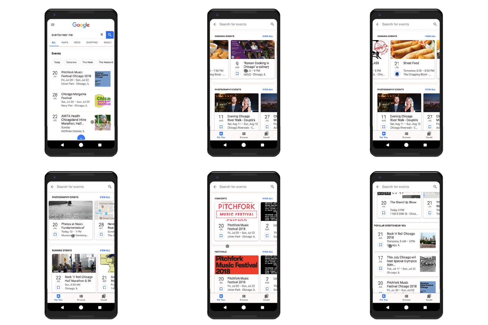
Last May, Google launched a new events feature designed to help web searchers more easily find things to do nearby, while also challenging Facebook’s dominance in the local events space. Today, Google is updating event search with personalized event suggestions, and well as a new design that puts more event information directly in the search results.

When the feature first launched last year, Google said it was built in response to the millions of search queries the company saw daily for finding local events and activities.

However, it was also clearly an area where Google had ceded ground to Facebook. The social network said last fall that 100 million people were using Facebook Events on a daily basis, and 650 million were using it across the network. Those numbers have surely grown since.

The original design for Google’s events search offered web searchers a list of events they could filter by category and date. Meanwhile, the event listings themselves were powered by data from Eventbrite, Ticketmaster, SeatGeek, Meetup, Vividseats, Jambase, LiveNation, Burbio, Allevents.in, Bookmyshow.com, StubHub, Bandsintown, Yext and Eventful.

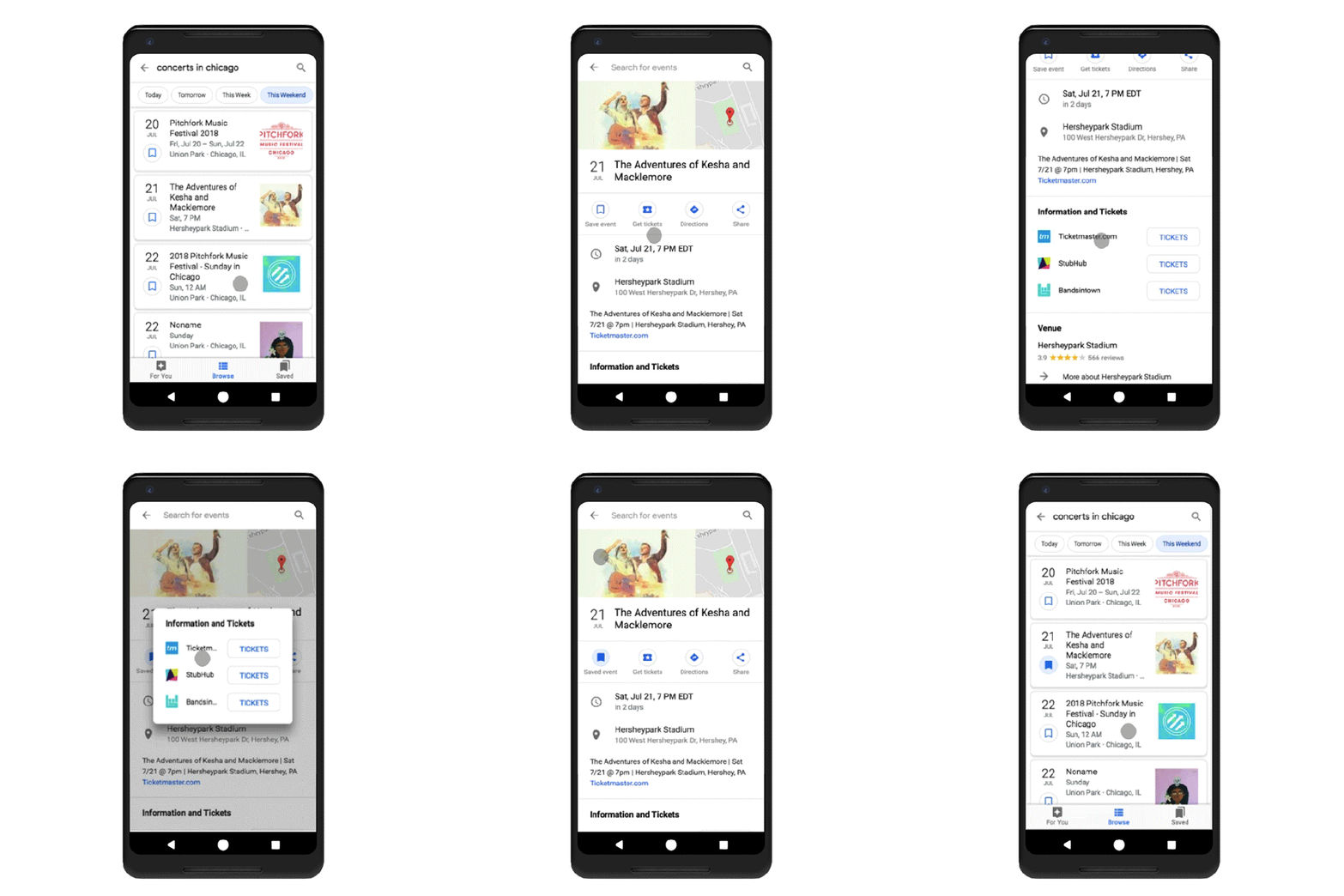
Now, Google is returning these event results in a new format – instead of more standard search results, they appear as cards, each with a little bookmark icon you can click on to save the event details for future reference.

In addition, when you tap on one of the event listings’ cards, you’re directed to a more information-rich page, offering the date, time, location, and shortcuts to save the event, buy tickets, get directions, or share it with others. The design looks even more like a Facebook event page, albeit without a discussion section for posts and comments.

Clicking on the “Get Tickets” button will pop up a window that links to ticket resellers for the event in question – like Ticketmaster or StubHub, for example.

As users continue to click, browse and save events, the system will also be trained to know what sort of events users like.

This data will be used to power the new personalized recommendations feature, found in the bottom navigation bar’s “For You” tab, which organizes suggested events by category, like “concerts,” “festivals,” “shows,” free events, and more. This page will also show you trending and popular events in the area, if you need ideas.

The feature is not currently live for everyone, but is rolling out to mobile users over the next few days, says Google.


Source: Tech Crunch

Virgin Galactic’s third supersonic test flight hits Mach 2 and 170,000 feet

Virgin Galactic is celebrating the third successful supersonic test flight of VSS Unity, the passenger spacecraft it intends to make available for space tourism in the near future. This flight took the craft higher and faster than ever, stressing the system and providing useful data for the rocket plane’s engineers.

Virgin’s two-part flight system uses a traditional jet-powered plane, the WhiteKnightTwo-class VMS Eve, to carry the spacecraft up to about 45,000 feet, after which the latter detaches and zooms ahead (and upward) on rocket power.

Each of Unity’s flights has pushed its specs a bit further: The first one, in April, achieved Mach 1.6 and just over 84,000 feet of altitude. The second, in May, hit Mach 1.9 and reached 114,500 feet.

Today’s went to Mach 2 and got up to 170,000 feet, touching the Earth’s mesosphere before gliding down to a soft landing. It’s still not nearly to space; the Karman Line, where space “officially” begins, is about twice as high. But at this rate it sure just seems like a matter of time before they get up there.

Importantly, the rocket powering Unity’s flight burned this time for 42 seconds, well over the 30 seconds or so it’s been fired for until now. These tests necessarily have to advance degree by degree, but going from 30 to 42 is a big jump that the engineers are probably thrilled about.

“Having been a U2 pilot and done a lot of high altitude work, or what I thought was high altitude work, the view from 170,000 feet was just totally amazing,” said one of the pilots, Mike “Sooch” Masucci, in a Virgin Galactic press release. “The flight was exciting and frankly beautiful. We were able to complete a large number of test points which will give us good insight as we progress to our goal of commercial service.”

The team is working on analyzing the data from this flight, and of course inspecting and tweaking the spacecraft, and we can probably expect another test flight in the next few months.


Source: Tech Crunch

Extras for bringing the fun at summer festivals

Editor’s note: This post was done in partnership with Wirecutter. When readers choose to buy Wirecutter’s independently chosen editorial picks, Wirecutter and TechCrunch may earn affiliate commissions.

One of the many ways to take full advantage of the summer is by attending long-awaited happenings and events. Summer festivals of all sorts come around every year, and they’re even better with a few friends — plus some extras to make the experience more memorable. No matter the type of event, having gear that allows you to kick back, keeps you hydrated and powered makes any festival day worthwhile.

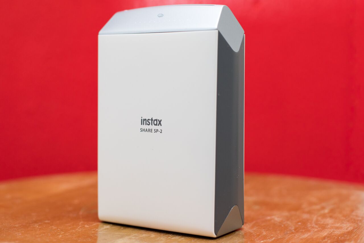
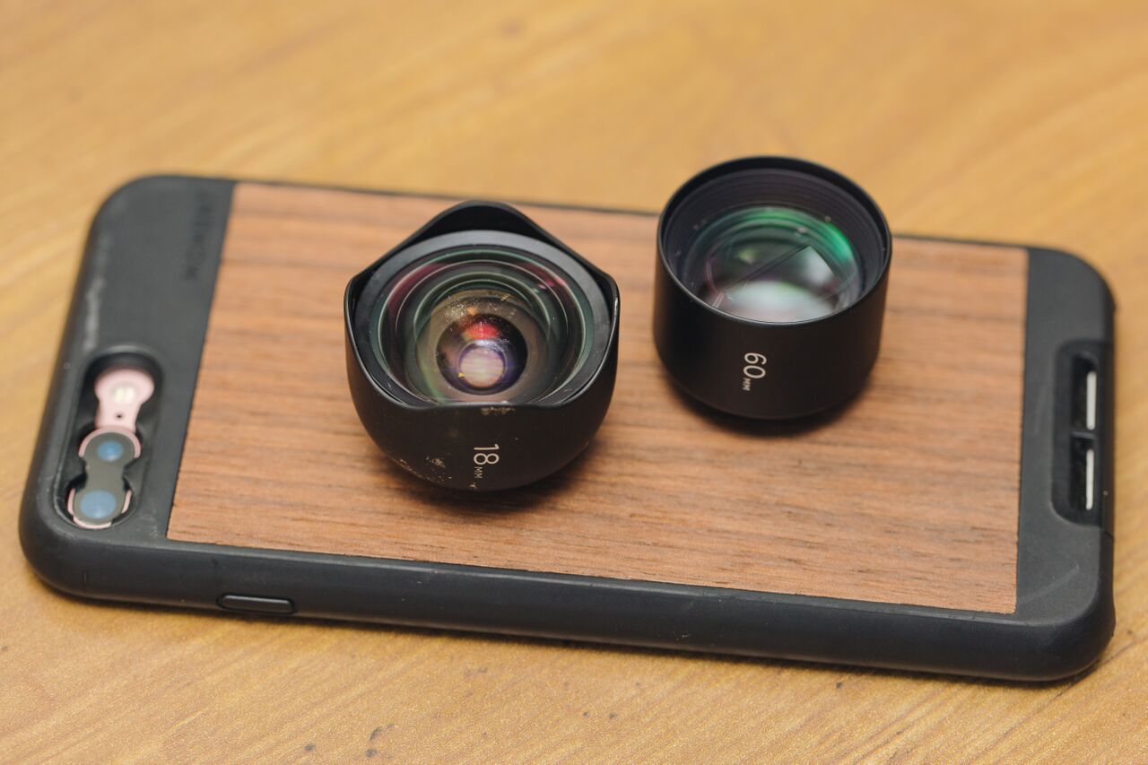
Photo: Kimber Streams                                                                                                                                                                                  

Inflatable couch: Live Infinitely Inflatable Air Lounger

For music festivals and events that have areas for camping or lounging (while waiting for the band you actually came to see), an inflatable couch will come in handy. The Live Infinitely Inflatable Air Lounger is 7 feet long, so it’s big enough to sit three people, or for one person to stretch out.

It comes with a stake to keep it from blowing away when it’s not in use, stays inflated longer than other couches we tested and folds down into a portable pack. Use its side pockets to store your phone, a water bottle and other belongings while you kick back and soak up the sun.

Instant Printer: Fujifilm Instax Share SP-2

Taking pictures to capture time spent at an exciting festival is a given. Though when attending with family or friends — especially those who you may not see often — having something tangible to take home makes the outing even better.

The Fujifilm Instax Share SP-2 is the instant printer pick in our instant camera guide, and we like that it’s portable and produces old-school Polaroid prints straight from a smartphone or tablet. It works through the Instax Share app and allows for filters and borders to be added to your snapshots. You can print one picture in about 10 seconds, or print multiples of one image for passing out to your group.

Lenses for iPhone Photography: Moment New Tele Lens & Moment New Wide Lens

When you get tired of taking group selfies and want to capture videos and pictures of the main event, a good smartphone lens attachment can help with getting closer to the action. While some smartphone cameras produce good photos, a lens attachment can further expand your phone’s field of view or extend the optical zoom without distorting images.

For photography enthusiasts who are fine attending events without a professional camera, our lens attachment picks for iPhones, the Moment New Tele Lens (for closer, high-quality shots) and the Moment New Wide Lens (for crisp, wide-angle photos) are great alternatives and offer more portability. They’re an improvement on the iPhone camera and are mounted on a case for lens attachments.

Kyle FItzgerald

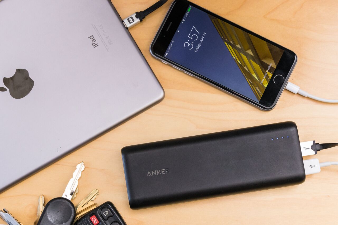
USB Battery pack: Anker PowerCore 20100

Spending long days at a fair or similar event means your phone will likely run out of juice before you’re ready to go. Bringing along a USB battery pack ensures that you’ll be able to stay powered while you’re having fun — and long after when you need to round up friends or call a ride.

The Anker PowerCore 20100 is small enough to fit in a backpack or purse and it has enough power to charge one smartphone everyday for nearly a week. It also can simultaneously charge two USB devices at full speed and will keep them powered for days before the battery pack itself needs to be recharged.

Photo: Rozette Rago                                                               

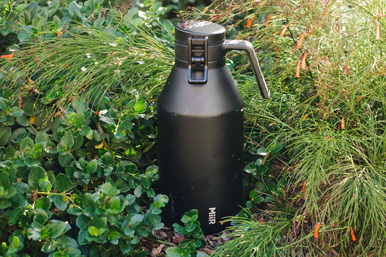
Growler: Miir 64 oz. Growler

Since you can’t bring a fan or AC everywhere, it’s almost necessary to have a drink or two on hand when you’re outside in the heat for long periods of time. For events that allow outside beverages, carrying them in a growler is a great way to keep them fresh, cold or hot.

We put eight growlers to the test and the Miir 64 oz. Growler had the best-tasting beer and fizzy drinks. We like the Miir’s design and that it’s easy to drink from, seal and handle. Its lid can be fully detached, which makes cleaning it by hand a bit easier. With a 64 oz. capacity, you’ll have more than enough of your favorite drink to last throughout the day, or to share.

This guide may have been updated by WirecutterWhen readers choose to buy Wirecutter’s independently chosen editorial picks, Wirecutter and Engadget may earn affiliate commissions.


Source: Tech Crunch

Daimler’s car2go car-sharing service adds its first US city in four years

Car2go, the free-floating car-sharing service owned by Daimler, launched in Chicago this week — the company’s 25th market globally. The car-sharing company, which lets customers rent out vehicles on a short-term basis, has been steadily expanding in the past several years, adding to and changing up its fleet beyond the diminutive Smart cars that were once the lone option for customers.

This launch stands out because it’s the first time in four years that car2go has added a U.S. city to its ranks. The last time car2go added a U.S. city was New York in 2014.

The car-sharing service has more than 3.3 million members worldwide, of which about 1 million are in the U.S. and Canada — a 25 percent growth over the prior year, according to the company. Today, the car-share service offers Mercedes-Benz CLA and GLA, as well as the two-door Smartfortwo vehicles.

Daimler was one of the first automakers to get into the car-sharing business. And others have followed, some of which have announced plans just in the past few months. In 2016, BMW’s ReachNow re-launched in North America and GM started Maven, which recently expanded its offerings to a peer-to-peer car-sharing service in Chicago, Detroit and Ann Arbor, Michigan. VW Group announced in July it will launch a car-sharing service next year in Germany that uses only electric vehicles, with plans to expand to other major cities in Europe, North America and Asia beginning in 2020. Volvo and Renault have also announced plans for a car-sharing service.

This automaker-jumps-into-car-sharing-story is indicative of a bigger trend within an auto industry grappling with how to earn money beyond the traditional business of building and selling cars. And this period of transition and experimentation isn’t likely to slow down.

If anything, expect more tinkering. For instance, Daimler announced Thursday it would break itself into three separate units — focused on trucks, its Mercedes-Benz car division and mobility — in a massive restructuring aimed at helping it keep pace with the emergence of automated and electric vehicles.


Source: Tech Crunch

ProtonMail now supports PGP encryption with other clients

ProtonMail is arguably the easiest way to send end-to-end encrypted emails. But encryption only works by default with other ProtonMail users. The company is adding full PGP support so that you can send and receive encrypted emails with people who use other apps and services.

ProtonMail is pretty much like iMessage or WhatsApp, but for email. All communications between two users are seamlessly encrypted. It’s transparent for the end user as you don’t need to manage encryption keys yourself.

But encrypted emails have been around for longer than ProtonMail. OpenPGP-compliant apps let you encrypt and digitally sign emails before sending them, even if your recipient isn’t using the same app. On the recipient’s side, you can check the sender’s signature and decrypt the message.

But PGP requires that both senders and recipients know how to use the standard. There are many extensions and plugins to use PGP in email apps. And now, ProtonMail lets you manage PGP communications directly in its service.

ProtonMail was already using PGP in the background. But now, the service is exposing those features to advanced users. You can import PGP public keys for your contacts and export your own key to share it with others. Encryption and decryption is then fully automated.

In order to make that possible, ProtonMail is launching an API to fetch public key encryption keys from ProtonMail users. Many users put their PGP key on their Twitter profile or website. But if you already know the ProtonMail email address of your recipient, you can get it from your browser directly (https://api.protonmail.ch/pks/lookup?op=get&search=username@protonmail.com).

Finally, exposing public keys also enables a new feature — address verification. If a server gets compromised or there’s a Man-in-the-Middle attack, a person could send an email pretending to be you but with a completely different set of public and private keys.

If you’re handling highly sensitive information, you can now manually verify the address of a specific contact. For instance, if you’re meeting with a contact in person, this person can show you their public key so that you can check it against your inbox. If those two keys are identical, you can choose to trust this key for future communications.

This is an overkill for your vacation photos, but Edward Snowden would love this kind of feature. ProtonMail is keeping basic encryption features accessible while giving more control to power users. This is a great way to get started and learn more about PGP, public and private keys as well as best practices.


Source: Tech Crunch