CBP does not make it clear Americans can opt out of airport face scanning, watchdog says

A government watchdog has criticized U.S. border authorities for failing to properly disclose the agency’s use of facial recognition at airports, which included instructions on how Americans can opt out.

U.S. Customs and Border Protection (CBP), tasked with protecting the border and screening immigrants, has deployed its face-scanning technology in 27 U.S. airports as part of its biometric entry-exit program.

The program was set up to catch visitors who overstay their visas.

Foreign nationals must complete a facial recognition check before they are allowed to enter and leave the United States, but U.S. citizens are allowed to opt out.

But the Government Accountability Office (GAO) said in a new report out Wednesday that CBP did “not consistently” provide notices that informed Americans that they would be scanned as they depart the United States.

A notice warning passengers of CBP’s use of facial recognition at U.S. airports. The GAO said these notices were not always clear that U.S. citizens can opt out. Image Credits: Twitter/Juli Lyskawa

“These notices are intended to provide travelers with information about CBP’s use of facial recognition technology at locations where this technology has been deployed, and how data collected will be used. The notices should also provide information on procedures for opting out, if applicable, among other things,” according to the watchdog. “However, we found that CBP’s notices were not always current or complete, provided limited information on how to request to opt out of facial recognition, and were not always available.”

Some of the notices were outdated and contained wrong or inconsistent information, the watchdog said. But CBP officials told the GAO that printing new signs is “costly” and “not practical” after each policy change.

CBP uses the airlines to collect biometric scans of a traveler’s face before boarding a plane. The data is fed into a database run by CBP, where face scans are held for two weeks for U.S. citizens and up to 75 years for nonimmigrant visitors.

As part of this cooperation, CBP is required to conduct audits to ensure that airlines are compliant with the agency’s data collection and privacy practices. But the watchdog found that CBP had only audited one airline, and as of May had “not yet audited the majority of its airline business partners to ensure they are adhering to CBP’s privacy requirements.”

The watchdog took issue with this following the 2019 data breach involving CBP subcontractor Perceptics, a license plate recognition company, which CBP accused of transferring travelers’ license plate data to its network without permission.

Hackers stole about 100,000 traveler images and license plate records in the breach, which were later posted on the dark web.

CBP said it concurred with the watchdog’s five overall recommendations.


Source: Tech Crunch

Submit your pitch deck to Disrupt 2020’s Pitch Deck Teardown

Disrupt 2020 is a few weeks away and we’re looking for founders to submit their pitch decks. In the Pitch Deck Teardown, top venture capitalists and entrepreneurs will evaluate and suggest fixes for Disrupt 2020 attendees’ pitch decks.

First impressions are everything, and pitch decks are often the first glimpse of companies by investors and business partners. It’s critical that these decks accurately present and illustrate the company’s goals and potential, concisely and effectively.

We’ve enlisted the help of some of the best venture capitalists. During these sessions, VCs will step through each slide, talking about what works, what doesn’t work and what needs to be changed to make the most impact. Along the way, expect to hear valuable insight on how investors evaluate pitch decks and the red flags that can shut down a potential investment.

What’s more, we’re looking for pitch decks to feature in these sessions. We want to showcase real pitch decks from actual companies. Anyone can submit their deck, though we’re looking for decks from early-stage companies. Submit your pitch deck here.

Some guidelines:

  • When submitting, please use the email you used when you registered for Disrupt 2020
  • Only pitch decks of registered Disrupt attendees will be selected
  • Early-stage companies are more likely to be selected for this session
  • If selected, you’ll be notified and told in which session your deck will be featured

Here are the investors signed up for the Pitch Deck Teardown:

  • Aileen Lee (Cowboy Ventures)
  • Charles Hudson (Venture Forward)
  • Niko Bonatsos (General Catalyst)
  • Megan Quinn (Spark Capital)
  • Cyan Banister (Long Journey Ventures)
  • Roelof Botha (Sequoia)
  • Susan Lyne (BBG)

Pitch Deck Teardown is part of a much larger event focused on all aspects of building technology companies. For the first time, TechCrunch’s big yearly event, Disrupt, is going fully virtual in 2020, allowing more people to attend and interact with speakers, investors and founders. And Disrupt will stretch over five days — September 14-18 — in order to make it easier for everyone to take in all the amazing programming. Prices increase soon, so get your pass now and then submit your pitch deck for invaluable feedback from our panel of VCs.

( function() {
var func = function() {
var iframe = document.getElementById(‘wpcom-iframe-bc5e644f85a11b970469253c6a947a65’)
if ( iframe ) {
iframe.onload = function() {
iframe.contentWindow.postMessage( {
‘msg_type’: ‘poll_size’,
‘frame_id’: ‘wpcom-iframe-bc5e644f85a11b970469253c6a947a65’
}, “https://tcprotectedembed.com” );
}
}

// Autosize iframe
var funcSizeResponse = function( e ) {

var origin = document.createElement( ‘a’ );
origin.href = e.origin;

// Verify message origin
if ( ‘tcprotectedembed.com’ !== origin.host )
return;

// Verify message is in a format we expect
if ( ‘object’ !== typeof e.data || undefined === e.data.msg_type )
return;

switch ( e.data.msg_type ) {
case ‘poll_size:response’:
var iframe = document.getElementById( e.data._request.frame_id );

if ( iframe && ” === iframe.width )
iframe.width = ‘100%’;
if ( iframe && ” === iframe.height )
iframe.height = parseInt( e.data.height );

return;
default:
return;
}
}

if ( ‘function’ === typeof window.addEventListener ) {
window.addEventListener( ‘message’, funcSizeResponse, false );
} else if ( ‘function’ === typeof window.attachEvent ) {
window.attachEvent( ‘onmessage’, funcSizeResponse );
}
}
if (document.readyState === ‘complete’) { func.apply(); /* compat for infinite scroll */ }
else if ( document.addEventListener ) { document.addEventListener( ‘DOMContentLoaded’, func, false ); }
else if ( document.attachEvent ) { document.attachEvent( ‘onreadystatechange’, func ); }
} )();


Source: Tech Crunch

3 ways COVID-19 has affected the property investment market

Two in five people would never invest their money — but those who would are most likely to invest in properties. This is the conclusion of a recent survey by Hargreaves Lansdown, and it shows that unless you invested in the stocks of a few companies like Amazon, PayPal, Apple or Nvidia, real estate has proven to be one of the most reliable investment options.

The last months have seen a global outpouring of cash deposits estimated at around $2 trillion and savvy investors are eager to score the best opportunities. However, is the real estate market well equipped to capture a substantial part of this sum, considering the current context of the pandemic?

The truth is, that COVID-19 has stirred up the long-settled dust on real estate investing. This could paint a bright future with promising – yet different – projects for developers, startups and investors.

1. Tech is giving property investment a new façade

When it comes to digitization, real estate certainly hasn’t been one of the frontrunners. However, this could all change now. COVID-19 has brought novel challenges, and technology has stepped up to offer the solutions.

Yet, in a sense, innovation is competing with time. The longer the pandemic drags on, the higher the chance that digitization initiatives will stick around for the long run. After all, it’s one thing to make short-term fixes by substituting a home viewing with a detailed video, and quite another rolling out an entirely new process that uses drone-supported imagery, satellite viewings and virtual tools to promote an entire portfolio. Either way, it’s clear that the pandemic has pushed real estate toward a cultural change centered around a greater reliance on technology.

This is great news for proptech, a sector that seeks to disrupt and improve the way we buy, rent, sell, design, construct, manage and invest in residential and commercial property. Since 2013, annual investment in U.S. proptech companies has grown at a rate five times that of investment in all U.S. businesses. So, being one of the fastest developing business sectors, proptech will maintain a strong momentum throughout COVID-19, especially when prioritizing products and services that save people time and money.

Along the way, it’s turning to the major technologies of the fourth industrial revolution, including the Internet of Things (IoT), artificial intelligence (AI) and machine learning (ML), blockchain, virtual and augmented reality, and much more. So, how specifically are property investment processes being affected by this trend?

House viewing and communication

According to João Richard Costa, the director of sales and marketing in a resort in the popular Portuguese region of Algarve, there was an initial bump in sales at the beginning of Q2, but the situation normalized fast — partially thanks to virtual viewings. “We’ve done some sales for people who haven’t even visited. They were happy to move forward on the basis of virtual tours and videos,” he said.

For some realtors, the pandemic was therefore not all that bad. House-bound investors had more time to interact, be it through emails and calls or by consuming content and attending webinars. In such a context, virtual viewings became well-received, inspiring realtors and different platforms to further improve their capabilities and champion seamless user experience.


Source: Tech Crunch

Amazon’s big redesign on iOS to reach all U.S. users by month-end

The Amazon app is getting a makeover. You may have already spotted the refreshed version of the Amazon shopping app with its new color scheme and revamped navigation if you’re an iPhone user. The changes began rolling out earlier this summer to iOS users in the U.S. and are on track to reach 100% of the U.S. mobile customer base on iOS by the end of this month. Other markets will see the updates arrive later this year and an Android release will then follow.

The company had not yet publicized the changes to its shopping app, but confirms the iPhone updates are a part its larger plan to make it easier to direct mobile users to their most-used features.

Amazon says the new version of the app will initially be available to customers in the U.S., Canada, Europe, China, Japan, and Central and South America, before reaching other markets.


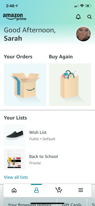
Image Credits: Amazon app/screenshot by TechCrunch

You may first notice the Amazon app seems brighter, thanks to a change that standardizes the app’s top navigation bar to a new blue-green gradient. However, the bigger changes are focused on how the app works, not the colors it uses.

The redesign’s larger aim, Amazon explains, was to make it easier for users to find what they are looking for — even when they’re using their iPhone with one hand, as is common.

As you move through the updated app, you’ll notice a new “Quick Access” bar floating on the bottom of the screen that offers shortcuts to the most frequently accessed features. This bar provides links to the app’s Home page, where you’ll find your personalized shopping recommendations, program offers and other seasonal content. The second button, a profile icon, takes you to your account page where you’ll find your orders, lists, account options, and previously browsed and searched items.

With the third button, you can access your Amazon cart, where you’ll also find your orders and your “Buy Again” suggestions.

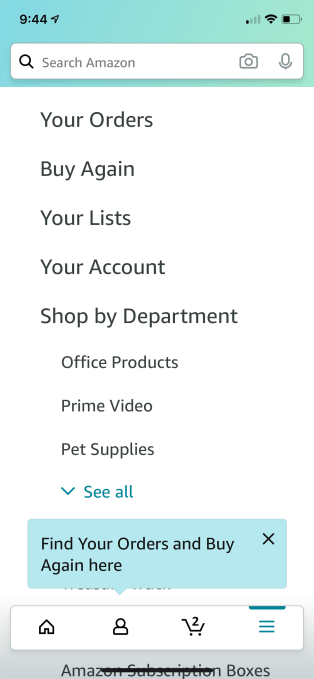
Finally, for those trying to navigate elsewhere in the Amazon app with one hand, the new Quick Access bar features its own “hamburger” menu (the three horizontal lines), where you can browse and discover other Amazon departments and programs, including deals, Whole Foods, and your Alexa Shopping List, among others.

Image Credits: Amazon app/screenshot by TechCrunch

The links listed in the navigation section are much larger than before, too, for easier reading on small screens.

Unfortunately, what Amazon hasn’t yet figured out how to manage its ever-growing list of “Programs & Features.” Today, this section of the app still somewhat randomly combines Amazon’s various initiatives like Treasure Truck, Subscription Boxes, curated collections (like Made In Italy or Amazon Launchpad), social features (like #FoundItOnAmazon), as well as its services like Amazon Fresh, Amazon Pantry, and others alongside links for physical destinations. (Amazon Go, for some reason, gets its own link, instead of being featured under Amazon Physical Stores.

Even the navigation’s name, the vague and all-encompassing “Programs & Features,” hints at a lack of organization. It’s also unclear why Amazon lists some things in both this section and in “Departments,” like Amazon Fresh. Meanwhile, others, like Amazon’s Handmade section, only gets one listing.

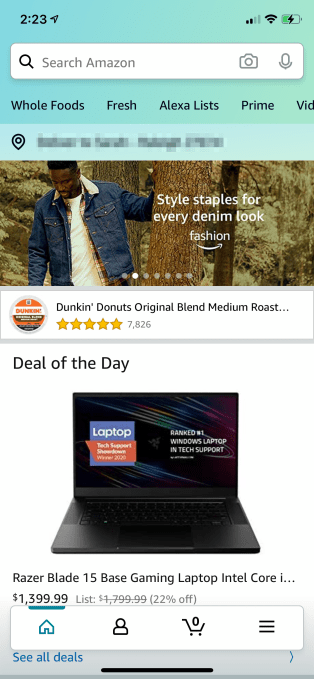
But Amazon likely has a plan in mind when it makes such choices. Online grocery, for example, is helping drive e-commerce sales amid the pandemic. It can’t hurt, then, to make Amazon’s grocery services easier to find by putting a link everywhere — including, of course, at the top of the home screen in the main navigation row.

Here, Amazon highlights its key features: Whole Foods, Fresh, Alexa Lists, Prime, Video, and Music. (Imagine how much screen real estate could be freed up if Amazon could only figure out how to consolidate its online grocery business into one service instead of two!)

Image Credits: Amazon app/screenshot by TechCrunch

Other areas of the app received layout changes in the redesign, as well.

At the top of the screen, for example, the app features a simplified navigation bar where you can quickly tap to perform a search using text or your camera or engage with Alexa.

An Amazon spokesperson confirmed the details and timeframe of its launch plans for the new app with TechCrunch.

“The new design for Amazon’s app on iPhone provides customers easier access to the features they use most, while on the go. This includes the homepage, account and order information, their cart and the ability to browse and discover Amazon departments and programs,” the spokesperson said.

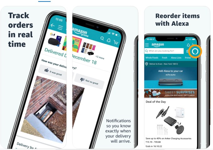
The retailer has yet to update its App Store listing to showcase the app’s new look-and-feel, which, for reference, is displayed below.

Image Credits: Amazon

Not every mobile makeover deserves attention, but this revamp is one of Amazon’s bigger updates to date — especially as it’s entirely moved its main navigation and even changed its brand’s color scheme. (Well, except for the app’s icon, which still features the classic, darker shade of blue.)

It’s also notable because Amazon’s app is one of the largest on iPhone, often in the top 20 in the U.S. App Store. It’s currently the No. 26 Overall app in the U.S., as of the time of writing.


Source: Tech Crunch

Dell’s U3219Q 32-inch 4K monitor provides a perfect home office upgrade

Dell has long held high esteem for the quality of its displays, and that hasn’t changed with its more recent models. What has changed is that more and more, people are looking for external monitors to complement their work laptops as they shift to more remote work – and settle in for more permanent home office configuration options. Dell’s 32-inch, 4K resolution UltraSharp U3219Q monitor is perhaps the best blend of quality, screen real estate, and connection flexibility you can get, provided your budget is in the mid- to high range.

The basics

The U3219Q has a 31.5-inch diagonal screen, with an IPS display and a matte finish that’s excellent for avoiding glare. Its max resolution is 3840 x 2160, with a 16:9 aspect ratio, and it can run at up to 60Hz refresh rate. It’s a very large display, but it feels a lot less large than it is, in part because of the extremely thin eels that surround the screen, and a relatively shallow depth. The display weighs just 12.8 lbs, which is extremely light when you consider just how much screen space it provides.

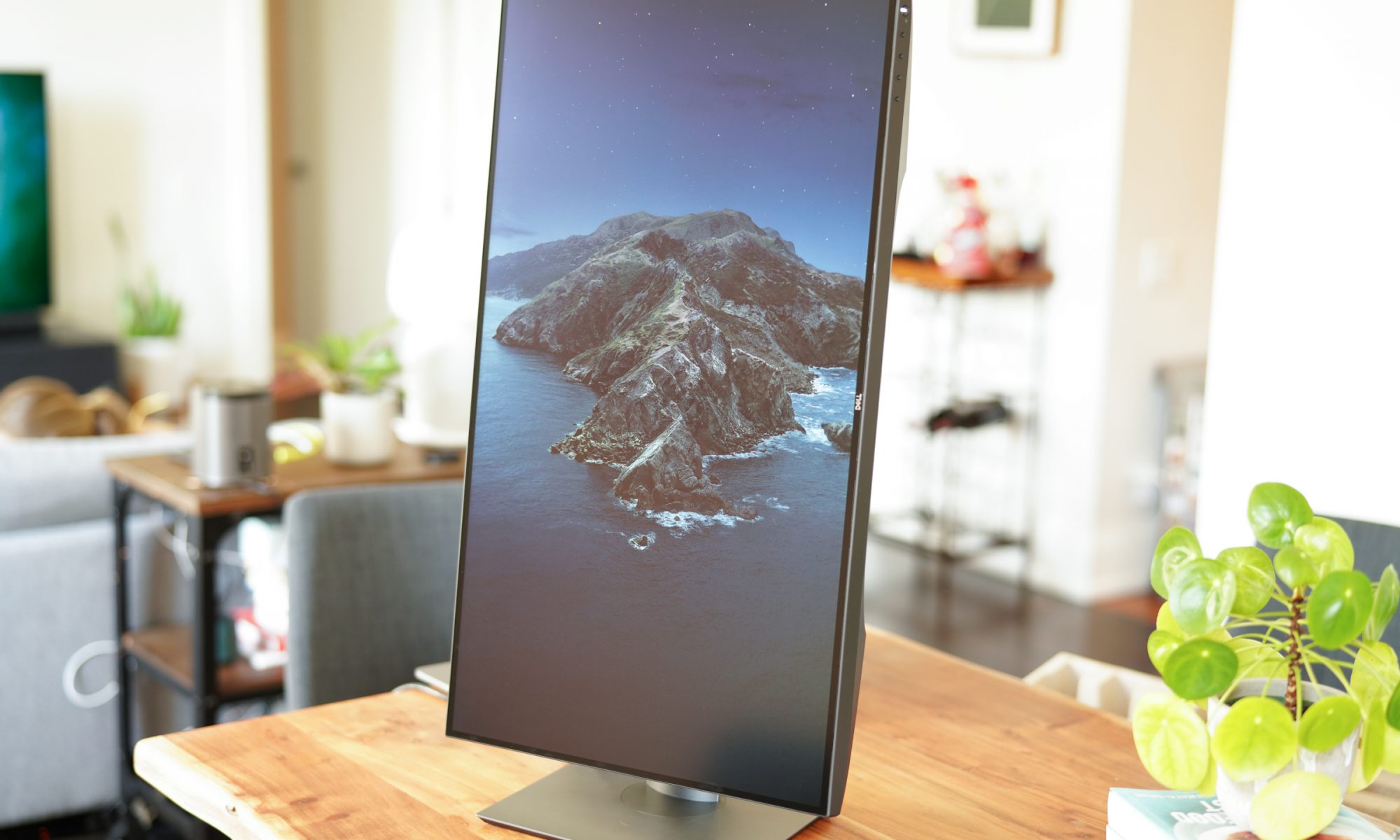
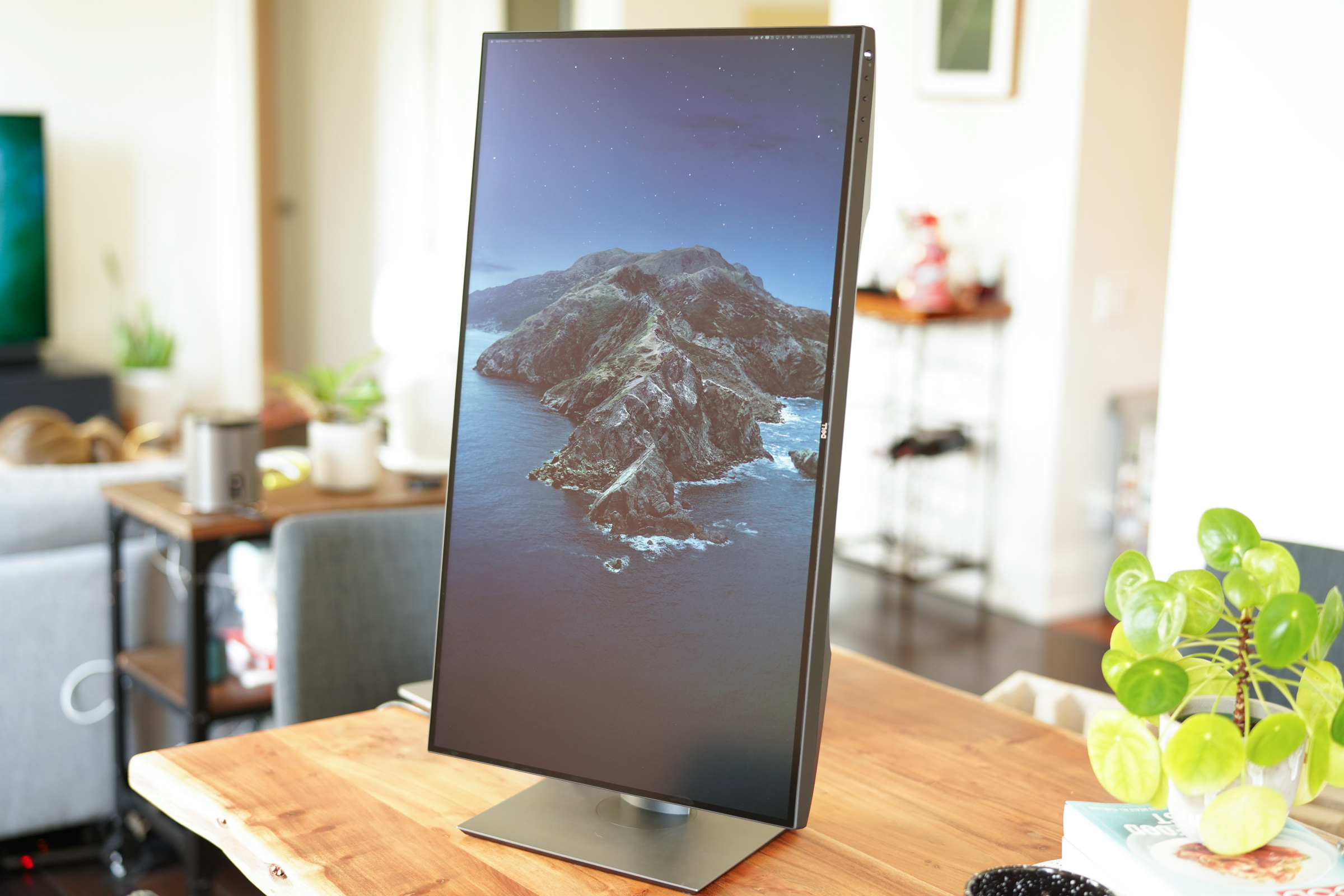
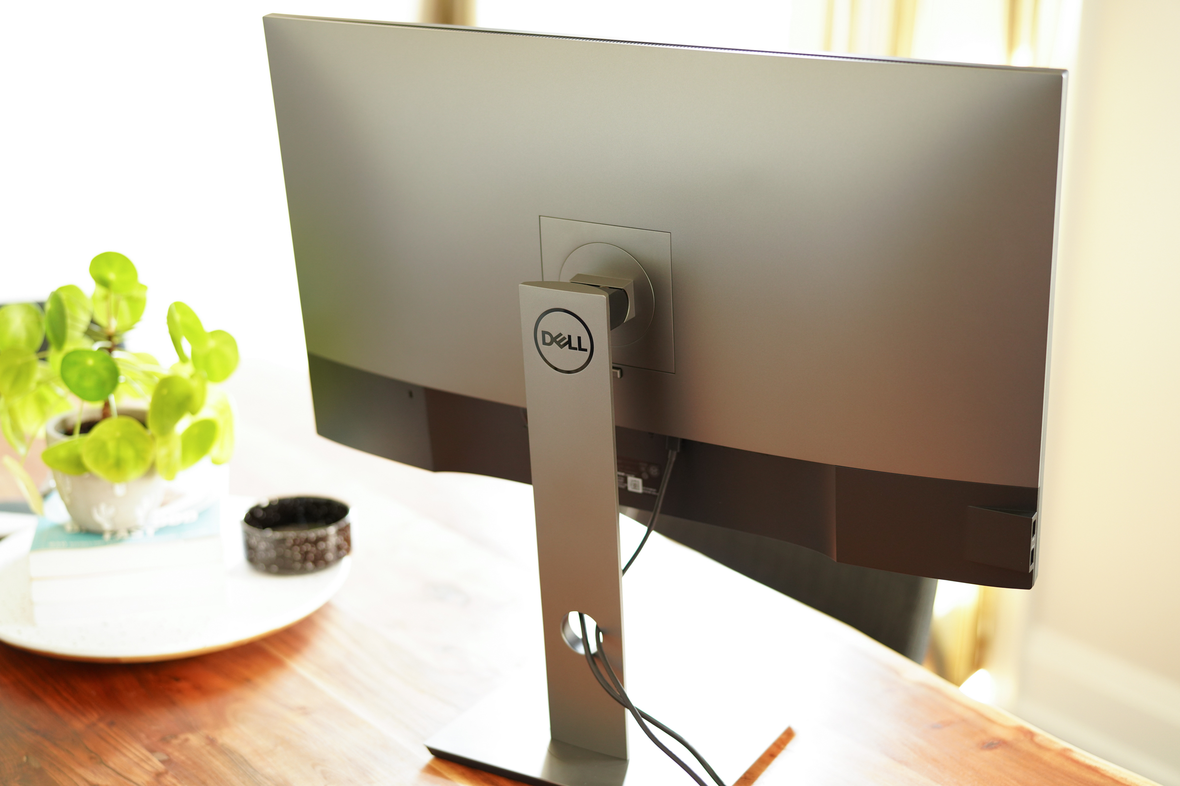
It comes with a stand that allows it to be adjusted across a range of around six inches up or down, and it’s able to be tilted up to 21 degrees, or swiveled 30 degrees in either direction. You can also rotate it from landscape to portrait, which is a handy feature for coding or document review, and it’ll still clear your desk with the integrated stand. The stand is also easy to remove, and it includes a standard 200×200 VESA mounting point for attaching it to monitor arms and wall mounts.

Image Credits: Darrell Etherington

For display connections, the U3219Q has 1 DisplayPort 1.4 and 1 HDMI 2.0 (both of which support HDCP 2.2 for playing back copyright protected content). There’s also a USB Type-C port which can provide DisplayPort 1.4 connectivity, as well as Power Delivery and USB 2.0 data connectivity, with a DP cable and a C-to-C cable included in the box. The monitor also features a USB 3.0 cable and port for connecting it to your computer to act as a hub, providing 2 USB 3.0 ports for accessories, as well as 2 USB 3.0 ports at the side of the display, and two of those also include charging power. While there are no built-in speakers, there is a 3.5mm audio output port for connecting headphones or an external speaker.

Dell touts the accuracy and quality of the panel, which boasts support for DisplayHDR content playback, and a factory color calibration that means it’s set to deliver 99% sRGB color accuracy out of the box, as well as 95% DCI-P3 and 99% Rec. 709 color for video. The display also features 400 nits of brightness, and 1.07 billion color depth along with impressive contrast. In short, it’s more than capable of handling even demanding video and photo editing tasks.

Design and performance

The Dell U3219Q lives up to its promises in terms of video and image quality. Out of the box, it looked fantastic when plugged into both a MacBook and a Mac mini, delivering excellent color rendering, contrast, brightness and blacks without any tuning. This is definitely a screen that has brightness to spare, useful if you’re working in a bright room with lots of natural sunlight, or if you need to crank up the brightness for specific tasks when editing photos or videos.

While the image quality is definitely a big advantage if you’re any kind of multimedia pro, that’s not the limit of who this screen should appeal to. The large size, and relatively small footprint, along with that 4K resolution, mean you can tune it to provide you with ample screen real estate depending on what resolution you choose. It’s easily able to handle multiple browser windows and applications arrayed next to one another in a variety of configurations, all while keeping text reasonable sized so that you don’t have to strain to read anything like you would running the same resolution on a smaller, but still 4K, screen.

Image Credits: Darrell Etherington

60Hz means that you’ve got a plenty fast enough display for smooth desktop computing and editing even 60fps video, but it’s not quite up to the high-speed standards that gamers are looking for today. Unless you’re very resinous about that, however, it’s a perfectly fine refresh rate for just about every other use.

Dell adding single cable USB-C connectivity makes it an ideal companion for modern Mac notebooks, allowing you to move from your couch to the desk with ease. Three total inputs across HDMI/USB-C and DisplayPort also mean you can have it connected to multiple devices at once, which can come in handy for some desktop console gaming breaks during your lunch break.

Video also looks fantastic on this display, either for editing or just for watching Netflix. And at 32-inches, it’s plenty capable of doing double duty in a home office/guest room where you want to also have a TV, but don’t want to invest in a second device. You would have to figure out an audio solution in that case, but Dell makes a monitor soundbar that you can add for $69 which mounts to the screen’s stand.

Bottom line

Image Credits: Darrell Etherington

Office upgrades are almost a must depending on where you work, and what their evolving policy is on work-from-home vs. cautious office re-opening. The Dell U3219Q is normally $1,049, but on sale at $839.99 via Dell direct right now, which is a lot to spend on a screen – but it’s also a device you use every day, and one that you want to provide the most bang for your buck and potential longevity. I actually currently use two Dell P2715Q monitors with my work setup, and both of these early generation 4K monitors are still going strong half-a-decade after I initially bought and began using them.

Dell’s also just launched a 32-inch curved 4K monitor (S3221QS) and a 27-inch 4K (S2721QS) that pack many similarly features but at lower price points depending on your budget. The company’s reputation for high-quality displays is well-earned regardless, however, and will serve any home office well, now and into the future.


Source: Tech Crunch

What will a Wish IPO look like? Seems we’ll find out sooner than later

Wish, the San Francisco-based, 750-person e-commerce app that sells deeply discounted goods that you definitely don’t need but might buy anyway when priced so low — think pool floaties, guinea pig harnesses, Apple Watch knockoffs — said yesterday that it has submitted a draft registration to the SEC for an IPO.

Because it filed confidentially, we can’t get a look at its financials just yet; we only know that its investors, who’ve provided the company with $1.6 billion across the years, think the company was worth $11.2 billion as of last summer, when it closed its most recent financing (a $300 million Series H round). Meanwhile, Wish itself says it has more than 70 million active users across more than 100 countries and 40 languages.

The big question, of course, is whether the now 10-year-old company can maintain or even accelerate its momentum. It’s not a no-brainer. On the one hand, it’s a victim of the increasingly chilly relations between the U.S. and China, from where the bulk of Wish’s goods come. Then again, Wish has been beefing up its business elsewhere in the world partly as a result of the countries’ shifting stance toward one another. For example, it told Recode last year that it’s increasingly looking to Latin American markets — Mexico, Argentina, Chile — for growth, and that it’s planning a bigger push into Africa, where it’s already available in South Africa, Ghana, and Nigeria, among other countries.

But let’s back up a minute first. If you don’t know, Wish was cofounded by CEO Peter Szulscewski, a computer scientist by training, who previously spent 6.5 years at Google before cofounding a company call ContextLogic, from which Wish evolved. The idea was to build a next-generation, mobile ad network to compete with Google’s AdSense network, but Szulscewski and his cofounder, Danny Zhang, realized they were “pretty bad at business development,” as he once said at an event hosted by this editor, so eventually they pivoted to Wish.

Wish began as an app that asked people to create wish lists, then the company approached merchants, letting them know a certain number of customers wanted, say, a certain type of table. It was smart to recognize that showing the right recommendations to shoppers would become critical to its users, though it didn’t necessarily foresee the types of merchants it would ultimately work with, most of them in China, Indonesia and elsewhere in East Asia and Southeast Asia who are focused on value-conscious customers and who, at the time, didn’t have other ways to sell to or communicate with customers elsewhere in the world (so didn’t mind paying Wish a 15% take to handle this for them).

Wish also quickly focused around lightweight items that it could ship cheaply from China, if slowly, using something called ePacket. It’s a shipping option agreement that established nine years ago with the cooperation of the US Postal Service and Hong Kong Post (and later made available to 40 countries altogether) that enables products coming from China and Hong Kong to be sent cheaply as long as they meet certain criteria — they don’t weigh too much, they aren’t worth too much, they adhere to certain minimum and maximums regarding their size, and so forth.

The mix has proved powerful for Wish, despite growing competition from China-based outfits like AliExpress that offer many of the same goods to the same customers around the world. (Wish has also competed, always, with Walmart and Amazon.)

The company has also soldiered on despite apparent struggles to keep customers coming over time, too. Because it doesn’t sell essential items but rather a grab bag of different items, people tend to cycle out of the app after a few months of their first visit, as The Information once reported.

A bigger issue now is that, as of two months ago, a new USPS pricing structure went into effect that raises rates on international shipments. It also requires foreign recipient countries to ratify new rates under ePacket (whose recipient countries, by the way, have been downsized from 40 to 12). That means that companies like Wish either pay more to ship their goods — forcing its vendors to charge more — or they move to commercial networks.

Of course, a third option — and one that may position Wish well for the future — would be for Wish to invest in more local warehousing in the U.S, Europe and others of its growing markets, which it told Recode that it is doing, along with seeking out more local vendors near its biggest markets.

Given shifts in the way that commercial real estate is being used — with retail-to-industrial property conversions accelerating, driven by the growth of e-commerce  — it’s probably as good a time as any for Wish to be making these moves. Whether they are enough to sustain and grow the company is something that only time will tell.

Again, we’ll collectively know much more when we can get a look at that filing. It should make for interesting reading.

Wish’s private investors include General Atlantic, GGV Capital, Founders Fund, Formation 8, Temasek Holdings and DST Global, among others.


Source: Tech Crunch

Jeff Lawson on API startups, picking a market and getting dissed by VCs

Last week TechCrunch sat down virtually with Jeff Lawson, the CEO and co-founder of Twilio as part of our long-running Extra Crunch Live series. As I expected, the chat was a good use of time.

Why? Lawson was early on the idea that software companies could deliver their features not through a web app, but through an API. Back when Twilio was getting started, the world was still uncertain on the future of cloud. But Twilio was already skating past that puck toward a more distant target.

And his company has been largely proven right in its view of the future. While cloud software is now the de facto position for startups and legacy providers alike, API-powered startups are having one hell of a year according to founders and investors.

The growing wave of API-delivered software is not looking set to slow down, with Lawson telling TechCrunch during our chat that “the world is getting broken down into APIs,” as “every part of the stack of business that a developer might need to build is eventually turning into APIs that developers can use.”

So, expect more startups to ask you to snag an API key instead of signing up for a 12-month commitment. That said, don’t get too excited, yet, as Lawson was also clear during our chat that “not everything that can be broken down into an API will end up being a huge business.”

As Salesforce helped set the stage for SaaS startups in year’s past, Twilio’s $40 billion market cap today could prove a similar North Star for API startups.

A big thanks to the Extra Crunch crew for showing up and helping us ask some fun questions. I’ve snagged some favorite quotes below and embedded the YouTube clip of the whole chat. Let’s go!


Source: Tech Crunch

Google’s AI-powered flood alerts now cover all of India and parts of Bangladesh

India, the world’s second most populated nation, sees more than 20% of the global flood-related fatalities each year as overrun riverbanks sweep tens of thousands of homes with them. Two years ago, Google volunteered to help.

In 2018, the company began its flood forecasting pilot initiative in Patna — the capital of the Indian state of Bihar, which has historically been the most flood-prone region in the nation, with more than 100 fatalities each year — to provide accurate real-time flood forecasting information to people in the region.

The company’s AI model analyzes historical flood data gleaned from several river basins in different parts of the world to make accurate prediction for any river basin.

For this project, Google has not worked in isolation. Instead, it has collaborated with India’s Central Water Commission, Israel Institute of Technology and Bar-Ilan University. It also works with the Indian government to improve how New Delhi collects data on water levels. They have installed new, electronic sensors that automatically transmit data to water authorities.

Thrilled by the initial results, two years later, Google’s Flood Forecasting Initiative now covers all of India, Google announced on Tuesday.

The company also said it has partnered with the Water Development Board of Bangladesh, which sees more floods than any other country in the world, to expand its initiative to parts of India’s neighboring nation. This is the first time Google is bringing Flood Forecasting Initiative outside of India.

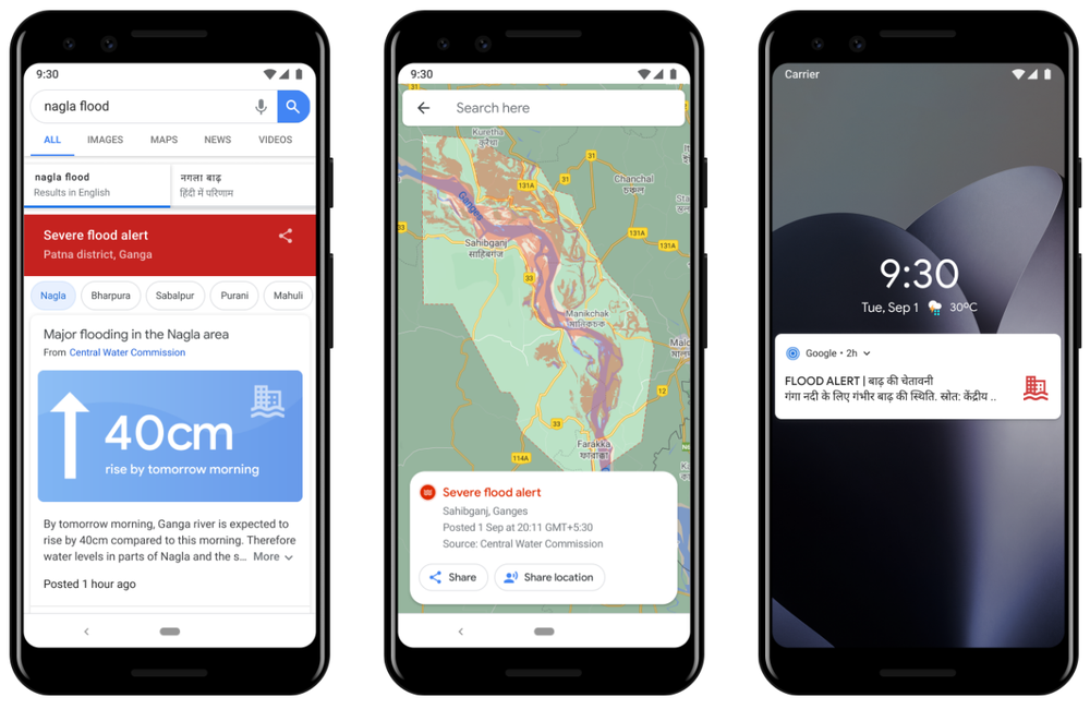
Alerts for flood forecasting (Image Credits: Google)

Part of the job is to deliver this potentially life-changing information to people. In India, the company said it has sent out more than 30 million notifications to date in flood-affected areas. It says its initiative can help better protect more than 200 million people across more than 250,000 square kilometers (96,525 square miles). In Bangladesh, Google’s model is able to cover more than 40 million people and the company is working to extend this to the whole nation.

“We’re providing people with information about flood depth: when and how much flood waters are likely to rise. And in areas where we can produce depth maps throughout the floodplain, we’re sharing information about depth in the user’s village or area,” wrote Yossi Matias, VP of Engineering and Crisis Response Lead at Google.

Along the way, the company said it worked with Yale and found that there was room for more improvement.

This year, Google said it overhauled the way its alerts look and function to make it more accessible to people. It also added support for Hindi, Bengali and seven other local languages, and further customized the messaging in the alerts. It has also rolled out a new forecasting model that doubles the warning time of many of its alerts.

Moving forward, the company said its charitable arm Google.org has started a collaboration with the International Federation of Red Cross and Red Crescent Societies to build local networks and deliver alerts to people who otherwise wouldn’t receive smartphone alerts directly.

“There’s much more work ahead to strengthen the systems that so many vulnerable people rely on—and expand them to reach more people in flood-affected areas. Along with our partners around the world, we will continue developing, maintaining and improving technologies and digital tools to help protect communities and save lives,” wrote Matias.


Source: Tech Crunch