Sources: Balderton Capital gearing up to invest in Swedish e-scooter startup VOI

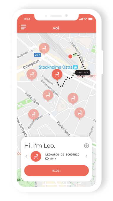
We already knew that the electronic scooter space in Europe was heating up, with Berlin’s Tier announcing today it has raised €25 million in a round led by Northzone, and rumours circulating that Delivery Hero founder Lukasz Gadowski has ventured into the space — all within the context of U.S. companies Bird and Lime recently expanding to Europe. However, now it seems that Balderton Capital could be about to make its move by investing in Sweden’s VOI Technology, another e-scooter rental play with pan-European ambitions.

According to multiple sources, the London-based venture capital firm is gearing up to lead a round in Stockholm-based VOI. Two sources say the amount being invested is $15 million at a pre-money valuation of between $35-40 million, while another source said it could be as much as $25 million. Separately, I’m hearing that with multiple term sheets on the table and the pace at which the company is growing, VOI is actually considering increasing the round to $50 million.

Other VC firms thought to be participating are Berlin’s Project A, and Netherlands-based Prime Ventures.

To date, VOI has raised just shy of $3 million in seed funding from Vostok New Ventures.

I contacted Balderton Capital earlier today, but haven’t heard back. A spokesperson for Project also declined to comment. Neither Prime Ventures or VOI could be reached at the time of publication.

What is particularly noteworthy about Balderton’s entrance into the e-scooter market is that three of the other “big four” London VC firms have already made U.S. investments in the space. Index and Accel have backed Bird, and Atomico has backed Lime.

As I noted in my earlier Tier funding story — which marked the biggest financial backing for a European company in the space to date — this isn’t stopping a number of European investors getting busy trying to create the “Bird or Lime of Europe,” even if it is far from clear that Bird or Lime won’t take that title for themselves (which is obviously the bet being made by Index, Accel and Atomico). The general sentiment of European VCs steadfastly trying to nurture a European born competitor is that they don’t want to see the e-scooter rental market be rolled over by the U.S. in the same way that Uber rode in and knocked out many local players.

With that said, the worse case scenario in the eyes of many of those same VCs (and those VCs standing on the sidelines not participating) is that Bird or Lime will eventually acquire the most promising European e-scooter company or companies. In other words, the downside is mitigated somewhat, failing an outright home run.

Meanwhile, Tier, VOI and Gadowski’s Go Flash aren’t the only European born e-scooter startups with pan-European ambitions. There’s also Coup, an e-scooter subsidiary owned by Bosch and backed by BCG Digital Ventures that operates in Berlin, Paris and Madrid. And just two month’s ago Taxify announced its intention to do e-scooter rentals under the brand Bolt, first launched in Paris but also planning to be pan-European, including Germany.

Not that everyone is convinced. Two early-stage European VCs I spoke to today said they hated the space. “I just don’t understand, isn’t it going to be a massive bloodbath?” said one of the VCs, before questioning the total number of rides we could see in Europe annually. “I just don’t see how Europe is going to produce multiple multibillion dollar businesses in this space. I think the market size caps it”.


Source: Tech Crunch

Richard Branson steps down as chairman of Virgin Hyperloop One

Richard Branson has reportedly stepped down from the chairman role of Virgin Hyperloop One.

In a statement, cited by Reuters, Branson said that the company would require a more time than he could devote to the company.

“At this stage in the company’s evolution, I feel it needs a more hands-on Chair, who can focus on the business and these opportunities. It will be difficult for me to fulfill that commitment as I already devote significant time to my philanthropic ventures and the many business within the Virgin Group.”

What wasn’t mentioned was the cancellation of a planned project with Saudi Arabia after Branson criticized the kingdom and suspended negotiations around an intended $1 billion investment from the nation’s Public Investment Fund into Virgin’s space operations.

Branson is one of several business leaders who have cut ties with the Kingdom of Saudi Arabia following the alleged assassination and dismemberment of dissident journalist Jamal Khashoggi.

Virgin Hyperloop’s largest investor is the United Arab Emirates shipping and logistics company DP World. Earlier this year, the two companies launched a logistics joint venture that would bring hyperloop technologies to the industry. DP World first invested in what is now Virgin Hyperloop back in 2016.

Earlier this month, Virgin Hyperloop released the results of a feasibility study conducted with Black & Veatch of the company’s planned route through Missouri to link St. Louis and Kansas City.

The independent report, authored by global infrastructure solutions company Black & Veatch, analyzes a proposed route through the I-70 corridor, the major highway traversing Missouri, and verifies the favorable safety and sustainability opportunities this new mode of transportation offers.

“A feasibility study of this depth represents the first phase of actualization of a full-scale commercial hyperloop system, both for passengers and cargo in the United States,” said chief executive Rob Lloyd, at the time. “We are especially proud that Missouri, with its iconic status in the history of U.S. transportation as the birthplace of the highway system, could be the keystone of a nation-wide network. The resulting socio-economic benefits will have enormous regional and national impact.”

In the U.S. Colorado and Ohio are also examining feasibility studies for Virgin Hyperloop technologies, while other projects are underway in India and the United Arab Emirates.

Hyperloop technology developers like Virgin Hyperloop One, Hyperloop Transportation Technologies, all get their inspiration from early plans drawn up by Elon Musk.

As we wrote at the time:

The Hyperloop features tubes with a low level of pressurization that would contain pods with skis made of the SpaceX alloy inconel, which is designed to withstand high pressure and heat. Air exiting those skis through tiny holes would create an air cushion on which the pods would ride, and they’d be propelled by air jet inlets. And all of that would cost only around $6 billion, according to Musk.

We’ve reached out to a spokesperson from Virgin Hyperloop One for comment and will update when we hear back.


Source: Tech Crunch

Ford expands self-driving vehicle program to Washington, D.C.

Ford is bringing its autonomous vehicles to Washington, D.C., the fourth city to join the automaker’s testing program as it prepares to launch a self-driving taxi and delivery service in 2021.

Ford will begin testing its self-driving vehicles in the district in the first quarter of 2019. The company is already is testing in Detroit, Pittsburgh and Miami. 

Ford is a bit different from other companies that have launched autonomous vehicle pilots in the U.S. Ford is pursuing two parallels tracks — testing the business model and autonomous technology — that will eventually combine ahead of its commercial launch in 2021.

Argo AI, the Pittsburgh-based company into which Ford invested $1 billion in 2017, is developing the virtual driver system and high-definition maps designed for Ford’s self-driving vehicles. Meanwhile, Ford is testing its go-to-market strategy through pilot programs with partners like Domino’s and Postmates, and even some local businesses.

The testing program in DC will follow that same thinking, with an emphasis on job creation and equitable deployment. Ford says its autonomous vehicles will be in all eight of the district’s wards. Eventually, it will operate business pilot programs in all eight wards, as well . Ford has already established an autonomous vehicle operations terminal in Ward 5, where it will house, manage and conduct routine maintenance on the fleet and continue developing its vehicle management process.

Argo AI already has vehicles on DC’s streets, mapping roads in the first step toward testing in autonomous mode, the company said.

“Both Ford and district officials are committed to exploring how self-driving vehicles can be deployed in an equitable way across the various neighborhoods that make up Washington, D.C., and in a way that promotes job creation,” Sherif Marakby, CEO, Ford Autonomous Vehicles LLC wrote in a Medium post Monday.

Marakby underscored a recent report by Securing America’s Future Energy that found autonomous technology could improve people’s access to jobs as well as retail markets.

Ford announced in July 2018 plans to spend $4 billion through 2023 in a newly created LLC dedicated to building out an autonomous vehicles business. The new entity, Ford Autonomous Vehicles LLC, houses the company’s self-driving systems integration, autonomous-vehicle research and advanced engineering, AV transportation-as-a-service network development, user experience, business strategy and business development teams. The spending plan includes a $1 billion investment in startup Argo AI.


Source: Tech Crunch

A look at the Android Market (aka Google Play) on its 10th Anniversary

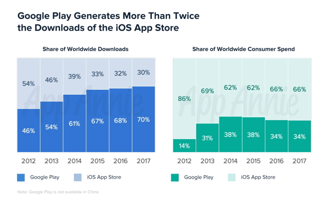
Google Play has generated more than twice the downloads of the iOS App Store, reaching a 70% share of worldwide downloads in 2017, according to a new report from App Annie, released in conjunction with the 10th anniversary of the Android Market, now called Google Play. The report also examined the state of Google Play’s marketplace and the habits of Android users.

It found that, despite the large share of downloads, Google Play only accounted for 34% of worldwide consumer spend on apps, compared with 66% on the iOS App Store in 2017 – a figure that’s stayed relatively consistent for years.

Those numbers are consistent with the narrative that’s been told about the two app marketplaces for some time as well. That is, Google has the sheer download numbers, thanks to the wide distribution of its devices – including its reach into emerging markets, thanks to low-cost smartphones. But Apple’s ecosystem is the one making more money from apps.

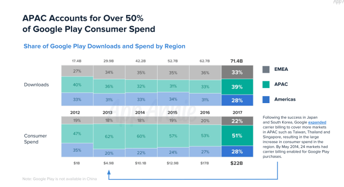
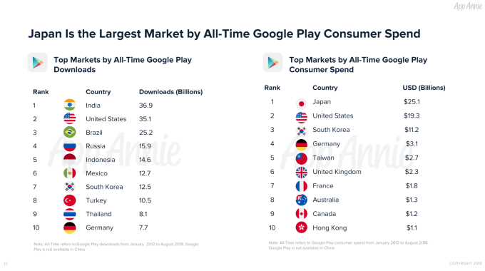
App Annie also found that the APAC (Asia-Pacific) region accounts for more than half of Google Play consumer spending. Japan was the largest market of all-time on this front, topping the charts with $25.1 billion dollars spend on apps and in-app purchases. It was followed by the U.S. ($19.3B) and South Korea ($11.2B).

The firm attributed some of Google Play’s success in Japan to carrier billing. This has allowed consumer spending to increase in markets like South Korea, Taiwan, Thailand and Singapore, as well, it said.

As to what consumers are spending their money on? Games, of course.

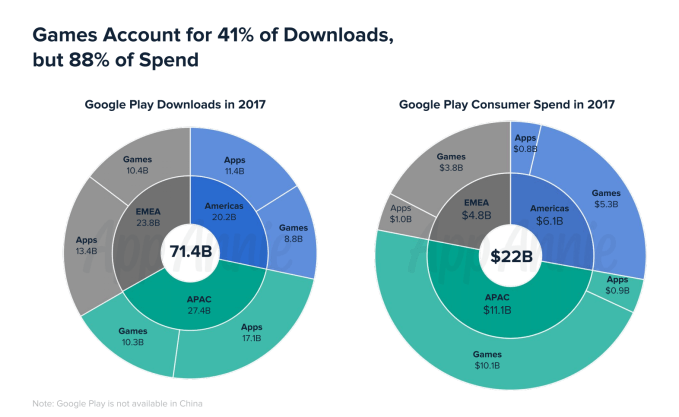
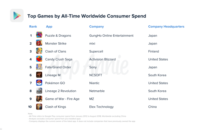
The report found that games accounted for 41% of downloads, but 88% of spend.

Outside of games, in-app subscriptions have contributed to revenue growth.

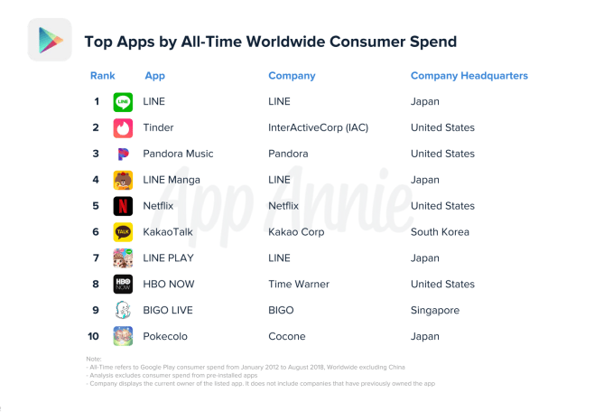
Non-game apps reached $2.7 billion in consumer spend last year, with 4 out of the top 5 apps offering a subscription model. The number one app, LINE, was the exception. It was followed by subscription apps Tinder, Pandora, Netflix, and HBO NOW.

In addition, App Annie examined the app usage patterns of Android users, and found they tend to have a lot of apps installed. In several markets, including the U.S. and Japan, Android users had over 60 apps installed on their phones and they used over 30 apps every month.

Australia, the U.S. and South Korea led the way here, with users’ phones holding 100 or more apps.

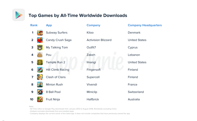
The report also looked at the most popular games and app of all time by both downloads and consumer spend. There weren’t many surprises on these lists, with apps like those made by Facebook dominating the top apps by downloads list, and subscription services dominating top apps by spend.

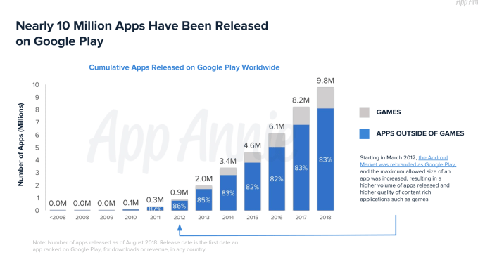
App Annie also noted Google Play has seen the release of nearly 10 million apps since its launch in 2008. Not all these remain, of course – by today’s count, there are just over 2.8 million apps live on Google Play.


Source: Tech Crunch

Cowboy, the Belgian e-bike startup, raises €10M Series A

Cowboy, the Belgian startup that designed and sells a smarter electronic bicycle, has raised €10 million in Series A funding.

Leading the round is Tiger Global Management, with participation from previous backers Index Ventures and Hardware Club. The new capital will be used to scale operations and expand beyond Belgium into Germany, U.K., Netherlands and France.

Founded in January 2017 by Adrien Roose and Karim Slaoui, who both previously co-founded Take Eat Easy (an early Deliveroo competitor), and Tanguy Goretti, who previously co-founded ridesharing startup Djump, Cowboy set out to build and sell direct a better designed e-bike.

This included making the Cowboy bike lighter in weight and more stylish than models from incumbents, and adding automatic motor assistance. The latter utilizes built-in sensor technology that measures speed and torque, and adjusts to pedaling style and force to deliver an added boost of motor-assisted speed at key moments, e.g. when you start pedaling, accelerate or go uphill.

In addition, Cowboy’s “smart” features powered by the Cowboy app enables the device to be switched on and off, track location, provide “ride stats” and support remote troubleshooting and software updates. A theft detection feature is also promised soon.

“We designed the Cowboy bike to appeal specifically to people who are yet to be convinced that electric bikes are a practical and mainstream mode of transport,” says Adrien Roose, Cowboy’s CEO, in a statement.

“We focused our attention on the three main reasons people are reluctant to purchase electric bikes: high cost, poor design and redundant technology — or a combination of the above — and we set about fixing them all.”


Source: Tech Crunch

Lime is building its first scooter ‘lifestyle brand store’ in LA

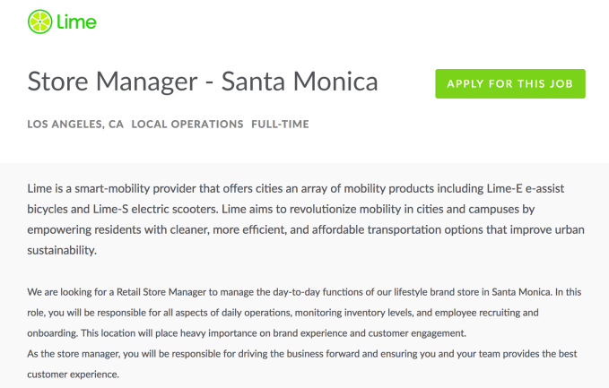
How can Lime differentiate its scooters and bikes from the piles of Birds and Spins filling Los Angeles sidewalks? Apparently with a physical storefront where it can convince customers of the wonders of on-demand mobility. According to a job listing from Lime seeking a “Retail Store Manager,” the startup plans to open a “lifestyle brand store in Santa Monica” that “will place heavy importance on brand experience and customer engagement.”

It seems Lime will rent vehicles directly from the store, given the full-time manager’s role includes “monitoring inventory levels” as well as daily operations, and employee recruiting. They’ll also be throwing live events to build Lime’s hype. Given the company is calling this a lifestyle store, the focus will likely be on showing how Lime’s scooters and bikes can become part of people’s lives and enhance their happiness, rather than on maximizing rental volume.

A rendering of Lime’s new office it’s building in San Francisco. The design could hint at what Lime wants to do with its retail store branding.

The listing was first spotted by Nathan Pope, a transportation researcher for consultancy Steer, and later by Cheddar’s Alex Heath. We’ve reached out to Lime and will update if we hear back from the company. Glassdoor shows that the store manager job was posted more than 30 days ago, and the site estimates the potential salary at $41,000 to $74,000.

The sheer number of Lime scooters in Santa Monica where the store will arise is already staggering. Supply doesn’t seem to be bottlenecking as it is in some other cities. Instead, it’s the fierce competition from hometown startups like local favorite Bird that Lime wants to overcome through brick-and-mortar marketing. Often you’ll see scooters from Lime and Bird lined up right next to each other. And with similarly cheap pricing, the decision of which to use comes down to brand affinity. According to Apptopia, Bird’s monthly U.S. downloads surpassed Lime’s in July for the first time ever, despite Lime offering bikes as well as scooters.

There are plenty of people who still have never tried an on-demand electric scooter, and going through the process of renting, unlocking and riding them might be daunting to some. If employees at a physical store can teach people that it’s not too difficult to jump aboard, Lime could become their default scooter. This, of course, comes with risks too, as electric scooters can be dangerous to the novice or uncoordinated. More aggressive in-person marketing might pull in users who were apprehensive about scooting for the right reason — concerns about safety.

As cities figure out how to best regulate scooters, I hope we see a focus on uptime, aka how often the scooters actually function properly. It’s common in LA to rent a scooter, then discover the handlebar is loose or the acceleration is sluggish, end the ride and rent another scooter from the same brand or a competitor in hopes of getting one that works right. I ditched several Lime scooters like this while in LA last week.

Regulators should inquire about what percentage of scooter company fleets are broken and what percentage of rides end within 90 seconds of starting, which is typically due to a malfunctioning vehicle. Cities could then award permits to companies that keep their fleets running, rather than that litter the streets with massive paper weights, or worse, vehicles that could crash and hurt people. Scooters are fun, cheap and therefore accessible to more people than Ubers, and reduce traffic. But unless startups like Lime put a bigger focus on helmets and safe riding behavior, we could trade congestion on the roads for congestion in the emergency room.


Source: Tech Crunch

Super Mario Party is Nintendo Switch’s best game

When I bought the Nintendo Switch a few months ago, my friends told me to buy Super Mario Odyssey, The Legend of Zelda: Breath of the Wild and Mario Kart 8 Deluxe. That’s precisely what I did, but none of those games were enough to get me hooked, which is probably for the best.

But then came Super Mario Party, which Nintendo released earlier this month for the Switch. I grew up gaming, but somehow never played Super Mario Party. Well, it seems as if I’ve been missing out my whole life.

Super Mario Party for Nintendo Switch is a quick, pick-up-and-play kind of game. You set the difficulty level, tell the game how much you want to party (ten, fifteen or twenty turns) and that’s how long you’ll party. But be careful playing with your friends or significant others — because it’s bound to stir up people’s competitive nature.

For those who are unfamiliar with Super Mario Party, it’s a digital board game. The name of the game (well, not literally) is to collect the most stars.

This is my character, Bowser Jr., collecting a star like a boss

To collect these stars, you roll one of two dice — a standard one or one that’s unique to your character. Some characters have dice that roll up to ten (like Donkey Kong and Bowser), but that also comes with the risk of not moving at all or losing coins, which you need to buy stars.

After each round, you play a mini-game, where you’re able to earn some more coins. Depending on the game, you’ll need to put your memory, hand-eye coordination or even sense of touch to work. Thankfully, there’s an opportunity to practice before each mini-game.

Throughout the game, there are opportunities to steal coins and stars from people. During my last party, Luigi stole a star from Yoshi (played by my girlfriend) and it wasn’t pretty. Let’s just say profanities were exclaimed.

There are more than 80 minigames available to play — some of which make great use of the Joy Con, the name for the Switch’s detachable controllers.

The party mode has four game boards. My favorite board (that is, the board on which I tend to perform the best, is Megafruit Paradise. Down the road, maybe through a software update of sorts, it’d be great to have more boards to choose from.

Super Mario Party also features a couple of other modes — river survival, where you control a boat with the Joy-Con paddles, a Sound Stage that reminds me of Dance Dance Revolution and mini-game mode, where you just play mini-games.

But in my experience, its the most fun to play the standard party mode. I’ve heard the best way to play the game is with four humans, but I’ve only ever played it with my girlfriend. We’re already both pretty intense about it so I could only imagine what it’d be like to play with two other people. Consider this my open invitation to holler at me to get a party started.


Source: Tech Crunch

Apple Watch Series 4 is the most accessible watch yet

Every time I ponder the impact Apple Watch has had on my life, my mind always goes to Matthew Panzarino’s piece published prior to the device’s launch in 2015. In it, Panzarino writes about how using Apple Watch saves time; as a “satellite” to your iPhone, the Watch can discreetly deliver messages without you having to disengage from moments to attend to your phone.

In the three years I’ve worn an Apple Watch, I’ve found this to be true. Like anyone nowadays, my iPhone is the foremost computing device in my life, but the addition of the Watch has somewhat deadened the reflex to check my phone so often. What’s more, the advent of Apple Watch turned me into a regular watch-wearer again, period, be it analog or digital. I went without one for several years, instead relying on my cell phone to tell me the time.

To piggyback on Panzarino’s thesis that Apple Watch saves you time, from my perspective as a disabled person, Apple’s smartwatch makes receiving notifications and the like a more accessible experience. As someone with multiple disabilities, Apple Watch not only promotes pro-social behavior, the device’s glanceable nature alleviates the friction of pulling my phone out of my pocket a thousand times an hour. For people with certain physical motor delays, the seemingly unremarkable act of even getting your phone can be quite an adventure. Apple Watch on my wrist eliminates that work, because all my iMessages and VIP emails are right there.

The fourth-generation Apple Watch, “Series 4” in Apple’s parlance, is the best, most accessible Apple Watch to date. The original value proposition for accessibility, to save on physical wear and tear, remains. Yet Series 4’s headlining features — the larger display, haptic-enabled Digital Crown and fall detection — all have enormous ramifications for accessibility. In my testing of a Series 4 model, a review unit provided to me by Apple, I have found it to be delightful to wear and use. This new version has made staying connected more efficient and accessible than ever before.

Big screen, small space

If there were but one banner feature of this year’s Apple Watch, it would indisputably be the bigger screen. I’ve been testing Series 4 for a few weeks and what I tweeted early on holds true: for accessibility, the Series 4’s larger display is today what Retina meant to iPhone 4 eight years ago. Which is to say, it is a highly significant development for the product; a milestone. If you are visually impaired, this should be as exciting as having a 6.5-inch iPhone. Again, the adage that bigger is better is entirely apropos — especially on such a small device as Apple Watch.

What makes Series 4’s larger screen so compelling in practice is just how expansive it is. As with the iPhone XS Max, the watch’s large display makes seeing content easier. As I wrote last month, once I saw the bigger model in the hands-on area following Apple’s presentation, my heart knew it was the size I wanted. The difference between my 42mm Series 3 and my 44mm Series 4 is stark. I’ve never complained about my previous watches being small, screen-wise, but after using the 44mm version for an extended time, the former feels downright minuscule by comparison. It’s funny how quickly and drastically one’s perception can change.

Series 4’s bigger display affects more than just text. Its bigger canvas allows for bigger icons and touch targets for user interface controls. The keypad for entering your passcode and the buttons for replying to iMessages are two standout examples. watchOS 5 has been updated in such a way that buttons have even more definition. They’re more pill-shaped to accommodate the curves of the new display; the Cancel/Pause buttons in the Timer app shows this off well. It aids in tapping, but it also gives them a visual boost that makes it easy to identify them as actionable buttons.

This is one area where watchOS excels over iOS, since Apple Watch’s relatively small display necessitates a more explicit design language. In other words, where iOS leans heavily on buttons that resemble ordinary text, watchOS sits at the polar end of the spectrum. A good rule of thumb for accessible design is that it’s generally better designers aim for concreteness with iconography and the like, rather than be cutesy and abstract because it’s en vogue and “looks cool” (the idea being a visually impaired person can more easily distinguish something that looks like a button as opposed to something that is technically a button but which looks like text).

Apple has course-corrected a lot in the five years since the iOS 7 overhaul; I hope further refinement is something that is addressed with the iOS 13 refresh that Axios’s Ina Fried first reported earlier this year was pushed back until 2019.

Of Series 4’s improvements, the bigger screen is by far my favorite. Apple Watch still isn’t a device you don’t want to interact with more than a minute, but the bigger display allows for another few milliseconds of comfort. As someone with low vision, that little bit of extra time is nice because I can take in more important information; the bigger screen mitigates my concerns over excessive eye strain and fatigue.

The Infograph and Infograph Modular faces

As I wrote in the previous section, the Series 4’s larger display allowed Apple to redesign watchOS such that it would look right given the bigger space. Another way Apple has taken advantage of Series 4’s big screens is the company has created two all-new watch faces that are exclusive to the new hardware: Infograph and Infograph Modular. (There are other cool ones — Breathe, Fire & Water, Liquid Metal and Vapor — that are all available on older Apple Watches that run watchOS 5.)

It’s not hard to understand why Apple chose to showcase Infograph in their marketing images for Series 4; it (and Infograph Modular) look fantastic with all the bright colors and bold San Francisco font. From an accessibility standpoint, however, my experience has been Infograph Modular is far more visually accessible than Infograph. While I appreciate the latter’s beauty (and bevy of complications), the functional downsides boil down to two things: contrast and telling time.

Contrast-wise, it’s disappointing you can’t change the dial to be another color but white and black. White is better here, but it is difficult to read the minute and second markers because they’re in a fainter grayish-black hue. If you choose the black dial, contrast is worse because it blends into the black background of the watch’s OLED display. You can change the color of the minute and second markers, but unless they’re neon yellow or green, readability is compromised.

Which brings us to the major problem with Infograph: it’s really difficult to tell time. This ties into the contrast issue — there are no numerals, and the hands are low contrast, so you have to have memorized the clock in order to see what time it is. Marco Arment articulates the problem well, and I can attest the issue is only made worse if you are visually impaired as I am. It’s a shame because Infograph is pretty and useful overall, but you have to be able to tell time. It makes absolutely no sense to add a digital time complication to what’s effectively an analog watch face. Perhaps Apple will add more customization options for Infograph in the future.

Infograph Modular, which I personally prefer, is not nearly as aesthetically pleasing as Infograph, but it’s far better functionally. Because it’s a digital face, the time is right there for you, and the colorful complications set against the black background is a triumph of high contrast. It is much easier on my eyes, and the face I recommend to anyone interested in trying out Series 4’s new watch faces.

Lastly, a note about the information density of these new faces. Especially on Infograph, it’s plausible that all the complications, in all their color, present an issue for some visually impaired people. This is because there’s a lot of “clutter” on screen and it may be difficult for some to pinpoint, say, the current temperature. Similarly, all the color may look like one washed-out rainbow to some who may have trouble distinguishing colors. It’d be nice if Apple added an option for monochromatic complications with the new faces.

In my usage, neither have been issues for me. I quite like how the colors boost contrast, particularly on Infograph Modular.

Haptics come to the crown

Given Apple’s push in recent years to integrate its so-called Taptic Engine technology — first introduced with the original Watch — across its product lines, it makes perfect sense that the Digital Crown gets it now. Haptics makes it better.

Before Apple Watch launched three years ago, I wrote a story in which I explained why haptic feedback (or “Force Touch,” as Apple coined it then) matters for accessibility. What I wrote then is just as relevant now: the addition of haptic feedback enhances the user experience, particularly for people with disabilities. The key factor is sensory input — as a user, you’re no longer simply watching a list go by. In my usage, the fact that I feel a “tick” as I’m scrolling through a list on the Watch in addition to seeing it move makes it more accessible.

The bi-modal sensory experience is helpful insofar as the secondary cue (the ticks) is another marker that I’m manipulating the device and something is happening. If I only rely on my poor eyesight, there’s a chance I could miss certain movements or animations, so the haptic feedback acts as a “backup,” so to speak. Likewise, I prefer my iPhone to ring and vibrate whenever a call comes in because I suffer from congenital hearing loss (due to my parents being deaf) and could conceivably miss important calls from loved ones or whomever. Thus, that my phone also vibrates while it’s ringing is another signal that someone is trying to reach me and I probably should answer.

Tim Cook made a point during the original Watch’s unveiling to liken the Digital Crown as equally innovative and revolutionary as what the mouse was to the Mac in 1984 and what multi-touch was to the iPhone in 2007. I won’t argue his assertion here, but I will say the Series 4’s crown is the best version of the “dial,” as Cook described it, to date. It’s because of the haptic feedback. It gives the crown even more precision and tactility, making it more of a compelling navigational tool.

Considering fall detection

As I watched from the audience as Apple COO Jeff Williams announced Series 4’s new fall detection feature, I immediately knew it was going to be a big deal. It’s something you hope to never use, as Williams said on stage, but the fact it exists at all is telling for a few reasons — the most important to me being accessibility.

I’ve long maintained accessibility, conceptually, isn’t limited to people with medically recognized disabilities. Accessibility can mean lots of different things, from mundane things like where you put the paper towel dispenser on the kitchen counter to more critical ones like building disabled parking spaces and wheelchair ramps for the general public. Accessibility also is applicable to the elderly who, in the case of fall detection, could benefit immensely from such a feature.

Instead of relying on a dedicated lifeline device, someone who’s even remotely interested in Apple Watch, and who’s also a fall risk, could look at Series 4 and decide the fall detection feature alone is worth the money. That’s exactly what happened to my girlfriend’s mother. She is an epileptic and is a high-risk individual for catastrophic falls. After seeing Ellen DeGeneres talk up the device on a recent episode of her show, she was gung-ho about Series 4 solely for fall detection. She’d considered a lifeline button prior, but after hearing how fall detection works, decided Apple Watch would be the better choice. As of this writing, she’s had her Apple Watch for a week, and can confirm the new software works as advertised.

Personally, my cerebral palsy makes it such that I can be unsteady on my feet at times and could potentially fall. Fortunately, I haven’t needed to test fall detection myself, but I trust the reports from my girlfriend’s mom and The Wall Street Journal’s Joanna Stern, who got a professional stunt woman’s approval.

Problematic packaging

Apple Watch Series 4 is pretty great all around, but there is a problem. One that has nothing to do with the product itself. How Apple has chosen to package Apple Watch Series 4 is bad.

Series 4’s unboxing experience is a regression from all previous models, in my opinion. The issue is Apple’s decision to pack everything “piecemeal” — the Watch case itself comes in an (admittedly cute) pouch that’s reminiscent of iPod Socks, while the band is in its own box. Not to mention the AC adapter and charging puck are located in their own compartment. I understand the operational logistics of changing the packaging this way, but for accessibility, it’s hardly efficient. In many ways, it’s chaotic. There are two reasons for this.

First, the discrete approach adds a lot in terms of cognitive load. While certainly not a dealbreaker for me, unboxing my review unit was jarring at first. Everything felt disjointed until I considered the logic behind doing it this way. But while I can manage to put everything together as if it were a jigsaw puzzle, many people with certain cognitive delays could have real trouble. They would first need to determine where everything is in the box before then determining how to put it all together; this can be frustrating for many. Conversely, the advantage of the “all-in-one” approach of Series past (where the case and band was one entity) meant there was far less mental processing needed to unbox the product. Aside from figuring out how the band works, the old setup was essentially a “grab and go” solution.

Second, the Series 4 packaging is more fiddly than before, quite literally. Instead of the Watch already being put together, now you have to fasten the band to the Watch in order to wear it. I acknowledge the built-in lesson for fastening and removing bands, but it can be inaccessible too. If you have visual and/or fine-motor impairments, you could spend several minutes trying to get your watch together so you can pair it with your iPhone. That time can be taxing, physically and emotionally, which in turn worsens the overall experience. Again, Apple’s previous packaging design alleviated much of this potential stress — whereas Series 4 exacerbates it.

I’ve long admired Apple’s product packaging for its elegance and simplicity, which is why the alarm bells went off as I’ve unboxed a few Series 4 models now. As I said, this year’s design definitely feels regressive, and I hope Apple reconsiders their old ways come Series 5. In fact, they could stand to take notes from Microsoft, which has gone to great lengths to ensure their packaging is as accessible as possible.

The bottom line

Three years in, I can confidently say I could live without my Apple Watch. But I also can confidently say I wouldn’t want to. Apple Watch has made my life better, and that’s not taking into account how it has raised my awareness for my overall health.

My gripes about the packaging and Infograph face aside, Series 4 is an exceptional update. The larger display is worth the price of admission, even from my year-old Series 3. The haptic Digital Crown and fall detection is the proverbial icing on the cake. I believe the arrival of Series 4 is a seminal moment for the product, and it’s the best, most accessible Apple Watch Apple has made yet.


Source: Tech Crunch
Blood money

Some years ago an investor I met at a TechCrunch event invited me out for a coffee. This happens a lot; as a weekly columnist here I am deemed an official Media Influencer, and people in turn want to influence me, until they realize I’m just going to ignore them and write about whatever weird idea comes into my head instead. I accepted this invitation, though, because this guy’s job was unusually interesting, in a bad way — he represented a venture fund affiliated with the Kremlin.

This was before Russia was the democracy-manipulating enemy it is today, but just after Russia passed its “anti-gay law,” so angry anti-Russian sentiment was exceptionally strong. It was fascinating to me watching this man squirm around the topic: I’m a Bay Area guy, he told me, I’m pro gay rights, pro gay marriage, but we have to accept that every country becomes enlightened at its own speed and its own way, and the best way for us to encourage that, to promote our values, is to engage with them, to show them the right way of doing things.

Needless to say this is a column about Saudi Arabia.

It’s kind of amazing that it’s taken the murder of Jamal Khashoggi to wake people up to that nation’s brutality. For three years now Saudi Arabia has been slaughtering thousands of Yemenis in a needless conflict wherein, to quote Bloomberg quoting the UN, “especially a Saudi Arabian-led coalition and the Yemeni government it backs, have shown a disregard for civilian life possibly amounting to war crimes.” It has long been a totalitarian absolute monarchy allied with what was once a radical interpretation of Islam, Wahhabism, which T.E. Lawrence described a hundred years ago as an obscure “fanatical heresy” — and which has since been mainstreamed with disastrous global consequences as a result of this alliance.

And, of course, it has long been an intimate international ally and partner of the United States. America’s financial / military / consulting / industrial / oil complexes have been in bed with the Saudis for a very, very long time, as have its politicians. Let’s not pretend that Saudi money in the tech industry is in any way exceptionally bad or different. Bad, yes, but as bad as, well, the rest of American society. For a long time the US attitude towards Saudi Arabia seems to have been: “sure, they’re an oppressive dictatorship, but they’re our oppressive dictatorship, and their royal family is very nice and very generous and they control so much oil.”

Now, though, at long last, that attitude seems to be changing. Not that the US is going to stop buying oil from them. Not that the US is going to stop selling weapons to them. But, despite occasional hesitant steps into the twentieth (but definitely not the twenty-first) century, nobody is going to pretend Saudi Arabia is anything other than a brutally oppressive state from here on in. (Shout-out to my homeland for being ahead of the curve on this one.) Which is progress, I guess, of a sort?

You can make a realpolitik case for continuing to engage with Saudi Arabia. Just like my coffee companion five years ago did for continuing to engage with Russia. See how well that turned out, how since then Russia has become so much more enlightened, so progressive, such a glorious contributor to the commonwealth of nations? …Oh. Saudi Arabia is different, yes, but in a worse way; it’s so sensitive to criticism, overreacts so wildly and violently, because it is fundamentally a fragile state. Nassim Taleb, who predicted the collapse of Syria and its civil war before it happened, has predicted a similar fate for Saudi Arabia.

I don’t think the Trump administration is going to continue its support for Saudi Arabia’s new and erratic leadership for fear of the human or economic consequences if they do otherwise. “Trump’s razor:” the stupidest reason is most likely to be correct. Here, that means the administration doesn’t want to walk back their Saudi support because they think that will make them look weak. Similarly, who are we kidding, VCs who take money from Saudi LPs aren’t doing so in order to help prop up the Pax Americana; it’s purely because they want the money, and nobody else is prepared to throw around $45 billion in cash.

Right now, though, and for the foreseeable future, sovereign Saudi money is tainted, poisoned, blood money. If you accept it you have to consider the consequences of publicly contravening our new, post-Khashoggi social morality, and the angry criticism which will follow. Will that last? Who can say? Even if it doesn’t, though, you’ll have to consider the consequences of privately contravening your own ethics, if you have any. That was also true last year, and it will still be true next year, no matter how much money we’re talking about.


Source: Tech Crunch

Early-bird pricing to Disrupt Berlin 2018 flies away in four days

Die uhr tickt, menschen — the clock is ticking, people. Early-bird pricing on passes to Disrupt Berlin 2018 migrates to parts unknown in just four days. If you want to join us at the Arena Berlin on 29-30 November — and save up to €500 in the process — you need to buy your pass before the 24 October deadline.

Thousands of people across Europe and beyond — founders, investors, marketers, technologists, coders, hackers — arrive ready to dive deep into the subject they love most: tech startups. Disrupt Berlin is always an exciting adventure, and we’re pumped about this year’s lineup of speakers and events.

Here’s just a quick sample of the speakers who will grace the Main Stage to share their stories and perspectives:

  • Lucas di Grassi, former F1 driver and current CEO of Roborace, will discuss how his company is merging human driving and artificial intelligence to build a better racing series.
  • Pieter van der Does, CEO of payments company Adyen, will share how the startup quietly built its empire and took a profitable company public.
  • Anne Kjaer-Riechert, founder of the ReDI School of Digital Integration, and Aline Sara, founder of NaTakallam, discuss using technology to address the world refugee crisis — specifically ReDI’s hugely successful code school for refugees and NaTakallam’s global platform for refugees to teach languages.

You don’t want to miss out on Startup Battlefield — our premier startup-pitch competition is a perennial favorite at every Disrupt event. Watch as 15 of Europe’s exceptional early-stage startup founders compete for $50,000 in non-equity cash, media and investor love and world-class bragging rights.

Over the years, Startup Battlefield alumni have gone on to become big-name tech companies — like Dropbox, Mint, Yammer and Tripit, to name but a few. Will you witness the birth of the next unicorn in Berlin?

There’s so much more to do and see at Disrupt Berlin: Q&A sessions, hands-on workshops, Startup Alley, world-class networking and the ever-popular (and insane) Disrupt After Party.

TechCrunch Disrupt Berlin 2018 goes down on 29-30 November, and the countdown to serious savings is on. Die uhr tickt — the clock is ticking. Buy your early-bird pass before 24 October and save up to €500.

( function() {
var func = function() {
var iframe = document.getElementById(‘wpcom-iframe-990a146e14c84e8a4808f8a5d6928a18’)
if ( iframe ) {
iframe.onload = function() {
iframe.contentWindow.postMessage( {
‘msg_type’: ‘poll_size’,
‘frame_id’: ‘wpcom-iframe-990a146e14c84e8a4808f8a5d6928a18’
}, “https://tcprotectedembed.com” );
}
}

// Autosize iframe
var funcSizeResponse = function( e ) {

var origin = document.createElement( ‘a’ );
origin.href = e.origin;

// Verify message origin
if ( ‘tcprotectedembed.com’ !== origin.host )
return;

// Verify message is in a format we expect
if ( ‘object’ !== typeof e.data || undefined === e.data.msg_type )
return;

switch ( e.data.msg_type ) {
case ‘poll_size:response’:
var iframe = document.getElementById( e.data._request.frame_id );

if ( iframe && ” === iframe.width )
iframe.width = ‘100%’;
if ( iframe && ” === iframe.height )
iframe.height = parseInt( e.data.height );

return;
default:
return;
}
}

if ( ‘function’ === typeof window.addEventListener ) {
window.addEventListener( ‘message’, funcSizeResponse, false );
} else if ( ‘function’ === typeof window.attachEvent ) {
window.attachEvent( ‘onmessage’, funcSizeResponse );
}
}
if (document.readyState === ‘complete’) { func.apply(); /* compat for infinite scroll */ }
else if ( document.addEventListener ) { document.addEventListener( ‘DOMContentLoaded’, func, false ); }
else if ( document.attachEvent ) { document.attachEvent( ‘onreadystatechange’, func ); }
} )();


Source: Tech Crunch