I honestly can’t remember when I first started writing about the mobile creep in macOS. It has happened little by little, update after update. My earlier fears that it would fully surrender to the influence of iOS have thus far not come to fruition, but the iPhone’s operating system continues to be the clearest indicator of future desktop updates.
It’s clear, of course, why one of Apple’s OSes would borrow so liberally from another. The iPhone has been top dog at the company for well over a decade now, and continues to monopolize resources and serve as a proving ground for its most cutting-edge experiences. Even as the Mac braces for its most radical update in recent memory with the switch from Intel to custom ARM processors, the shadow of iOS looms large over Big Sur.
There are a million reasons why this year’s WWDC was a strange one. One of the more unsung instances was the surprise reveal that the next version of macOS would be 11.0. The fact was never explicitly mentioned during the keynote, though the number was flashed on screen during a demo. It certainly seems worth mentioning the first primary number upgrade in 20 years, but who can ultimately say why Apple does the things it does?
What we can say for sure is that Big Sur does, indeed, represent a big step forward in macOS’ evolution in a couple of ways. The first and arguably most important is the aforementioned hardware update. Those first systems are set to arrive toward the end of the year, likely in the form of new iMac and MacBooks. The second and arguably more symbolic is one of the more radical design changes in the operating system’s recent memory.

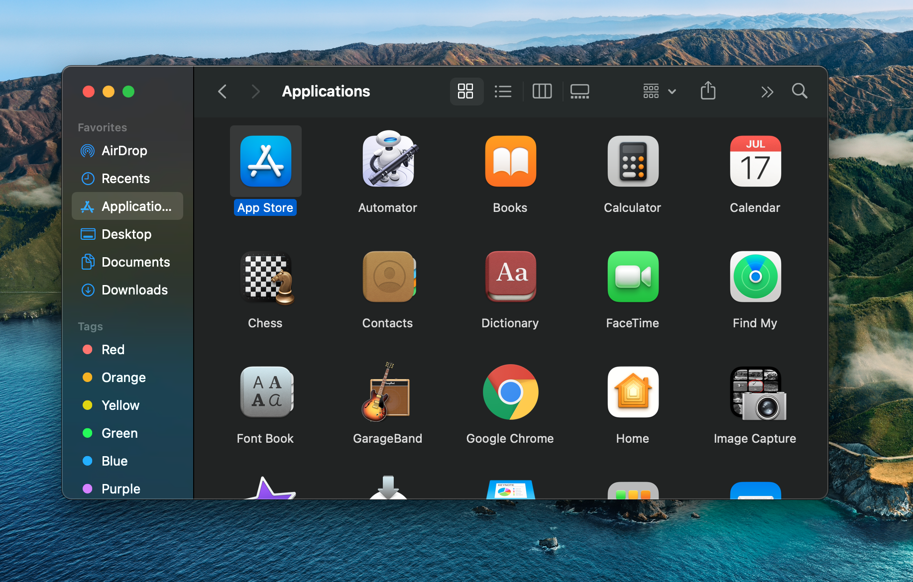
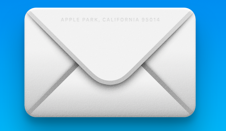
For those less familiar with the operating system, the design changes likely feel subtle. For those of us who basically spend all day, every day staring at the operating system, they’re unavoidable. Big Sir borrows liberally from the iOS design language. The familiar circle icons are gone, making way for the squircle variety you’ll find on the iPhone. As ever, it’s up to third-party developers to decide if they want to join in on the fun. Right now, my app folder is a mix of circles and rounded squares. There are fun little touches throughout, like this address on the Mail icon envelope:
Another iOS influence comes in the form of the push toward more translucence throughout the UI, most notably in the form of the menu bar, which is a closer match to the drop-down menus themselves. Those are larger, meanwhile, and offer a bit more room to breathe. Spacing in general is a big thing throughout the update.

That includes the new Finder windows, which also adopt more translucent elements and rounded corners. The dock, meanwhile, hovers ever so slightly above the bottom of the screen. Default sound updates might take me the longest to get used to. I only discovered that while taking a screenshot for this review — the familiar camera shutter sound having been swapped out for a bit of a plunk. Not sure how I feel about that one, if I’m being honest.
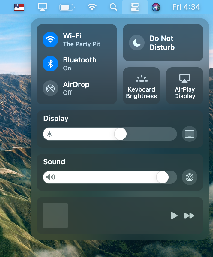
Perhaps the biggest update to Finder is also the most blatant lift from iOS. Joining other elements like Notification Center and Launchpad is Control Center. As with iOS, it’s a translucent drop-down menu that offers quick access to settings. Here it’s accessible by way of an icon in the menu bar, but every element here screams touchscreen. Seriously, the Display Brightness and Sound sliders beg to be adjusted by hand. A clear hint into plans for future Macs? Apple has long insisted that PCs and touchscreens are like oil and water, but there are some indications that the company’s stance could be softening.
Other control panel options include a Do Not Disturb mode, media playback, WiFi, Bluetooth and Airdrop. The available controls are customizable, and you can also drag an option off the panel and pin it to the menu bar.
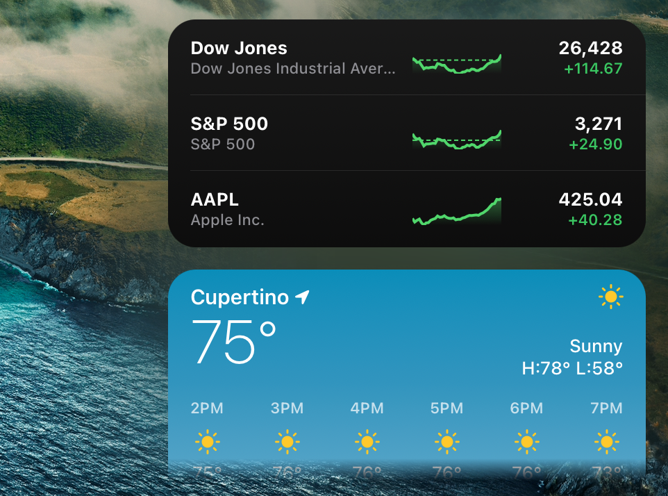
Speaking of the Notification Center, there’s an update there as well. It’s free-floating, like other new design elements, and features a lot more information options, including weather, stocks and calendar events, along with upcoming third-party widgets. Like the Control Center, it’s customizable, both in terms of content and widget size. Certain forms of content like emails and new podcasts can also be interacted with directly from the Notification Center.
A number of updates to the Messages app itself are also worth noting here. Conversations can easily be pinned to the top of the list with a drag and drop. Group messaging has been beefed up, with the ability to comment on specific messages in line — a feature that’s simultaneously rolling out in iOS 14, as well. Specific members can be directly mentioned with an “@“ symbol and a photo can be set to designate the group.
Also of note is an improved search. Honestly, search has long been an annoyance on the desktop version of the app. Here it groups together links, photos and other highlights. There are a bunch of new message effects here, à la iOS, with things like balloons, confetti and lasers for celebration. Memojis can now be edited on the desktop, and Apple has also added Memoji stickers for quicker reactions.
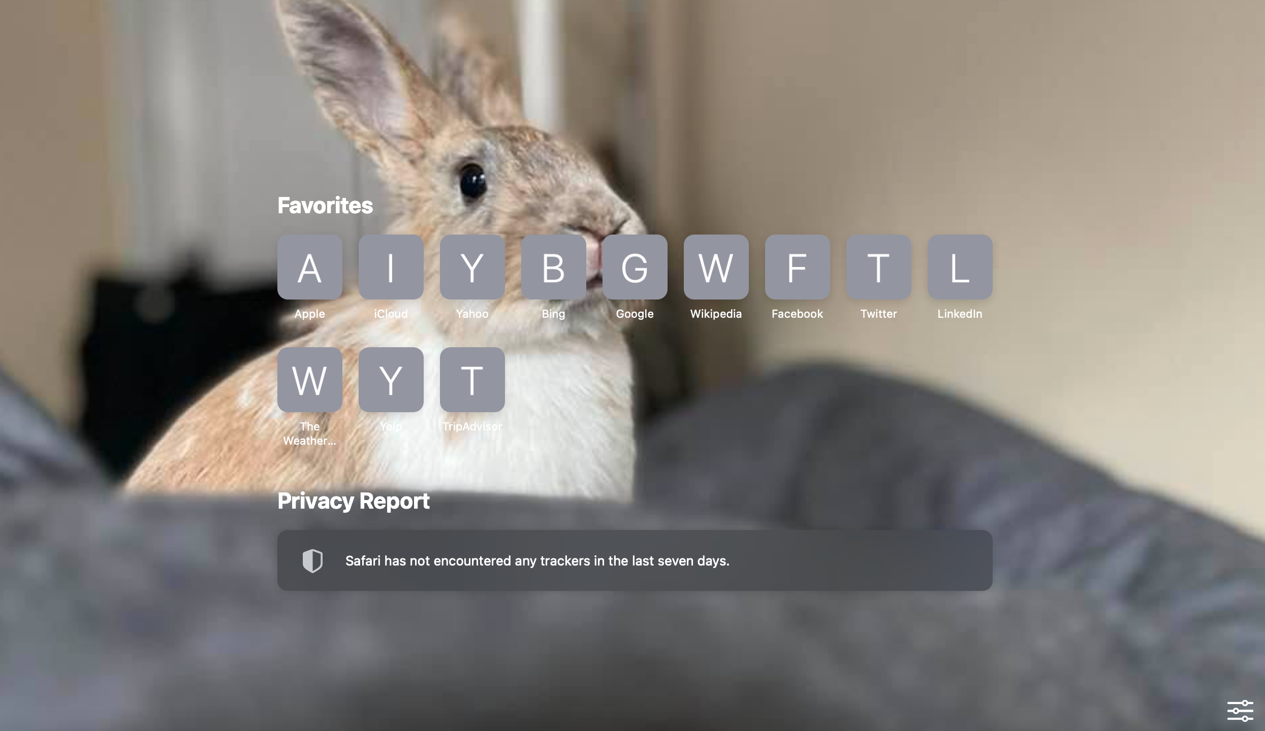
Safari always seems to get the most love in the updates. It’s clear that Apple really wants its browser to remain competitive with the likes of Chrome and Firefox. Key updates include the ability to set a background image and customizable start page, manually adjust favorites and support for more extensions.

Tabs have been redesigned and favicon now appear by default, while hovering over a tab will show a preview of the hidden page — a genuinely useful addition. Rending speeds have improved and the company says the browser is overall more power-efficient than earlier versions. Apple’s also found another way to directly take on Google with the addition of a new translate feature that’s currently in beta with seven languages: English, Spanish, Simplified Chinese, French, German, Russian and Brazilian Portuguese.

A handful of new maps features warrant mention here. Look Around brings a new Street View-style feature, making it easy to get to where you’re going — or simply live vicariously in this time of immobility. Clicking “Look Inside” on select locations like airports and malls, meanwhile, will show you an overhead view of the indoor map. Cycling directions have been added to a handful of cities (they don’t quite appear to have rolled out for NYC on the beta I’m using), along with an Electric Vehicle direction feature that shows you the route with the most charging station access.
The Big Sur public beta is out today. The final version of the software is set to release this fall.
Source: Tech Crunch


